UX Portfolio
HCA Inspire App
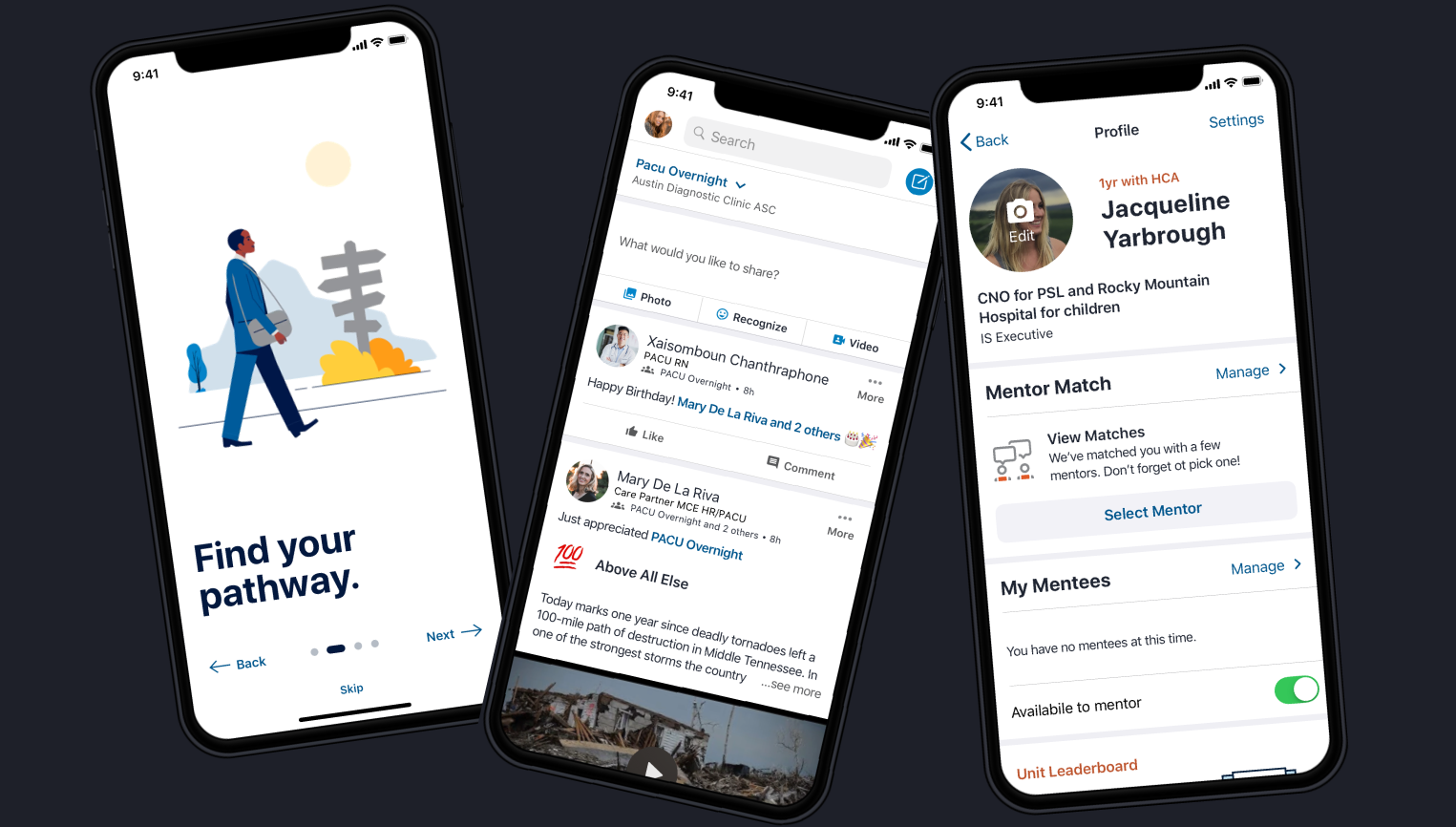
Overview
Timeline
OCT 2020 - FEB 2021
nine 2 week sprints
The Problem
In 2021, the Inspire employee app struggled with unclear positioning and uneven engagement across roles and facilities. While Inspire was intended to be a secure, internal alternative to consumer social platforms, employees increasingly relied on less secure channels such as Facebook groups, LinkedIn communities, and ad hoc messaging tools to stay connected.
Our team partnered with product, engineering, and internal communications to redesign Inspire’s core community, communication, and notification experiences. The goal was to improve clarity, trust, and participation for a distributed healthcare workforce spanning frontline clinical staff, environmental services, corporate employees, and leadership across both iOS and Android.
Business Impact
Delivered an improved mobile app social platform for facility employees and nurses to post, provide and find mentorship, recognize their peers, navigate their career path, and check their schedules. Beyond improving Inspire itself, this work surfaced broader consistency gaps across HCA’s internal digital ecosystem, ultimately prompting HR to initiate a wider UI and interaction consistency overhaul across employee-facing systems.
+32% daily app usage increase in Amplitude
+3 new hospital markets adopted the app
-26% reduction in service tickets quarterly
+4% employee engagement score increase
My Role
I led discovery → synthesis → IA → wireframes → validation, partnered on prototype + UI, and stayed engaged through handoff, build support, QA, launch, and iteration.
Deliverables
UX research and stakeholder discovery
Personas, journeys, and behavioral insights
Information architecture and task-flow definition
All iOS and Android wireframes
Cross-platform high-fidelity designs using the Neutron Design System
Usability testing, iteration, and design QA
Android design standards documentation
Enterprise consistency recommendations across internal systems
Meet the Team
-

Cydney Marsh (me)
UX Designer , Lead Research & UI
-

Holly Stewart
UX Designer, Hi-Fidelity UI
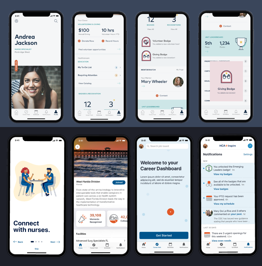
Before vs. After
Critical Questions
The Inspire app wasn’t helping employees quickly answer:
“Is this app actually for someone like me, or just corporate?”
“What should I pay attention to first when I open the app?”
“How do I know if anything important happened since my last shift?”
“Is this a trusted, official HCA tool or just another social feed?”
“How does this help me with my job, my schedule, or my career?”
For many frontline and ancillary employees, Inspire required too much interpretation. Subtle cues, icon-heavy navigation, and gamification elements made it difficult to understand what mattered, especially for users with limited time or lower technical comfort.
As a result, employees defaulted to external tools that felt faster and clearer, despite being less secure.
Constraints
Highly distributed healthcare workforce with wide variation in role, schedule, and technical comfort
Frontline clinical staff accessing the app between shifts with limited time and attention
Limited or inconsistent email access for many non-corporate employees
Enterprise consistency vs. local facility needs, flexibility without fragmentation
Existing perceptions of Inspire shaped by earlier design and feature decisions
High trust and accessibility requirements inherent to healthcare environments
iOS 13 and Android mobile platforms, designed in parallel with platform-specific patterns
Neutron design system and mobile standards updated for all high-fidelity
Incomplete and evolving product requirements, requiring research and stakeholder input to shape scope in parallel with design
Usability validation on wireframes required before high-fidelity design and development handoff
Stakeholder Interviews
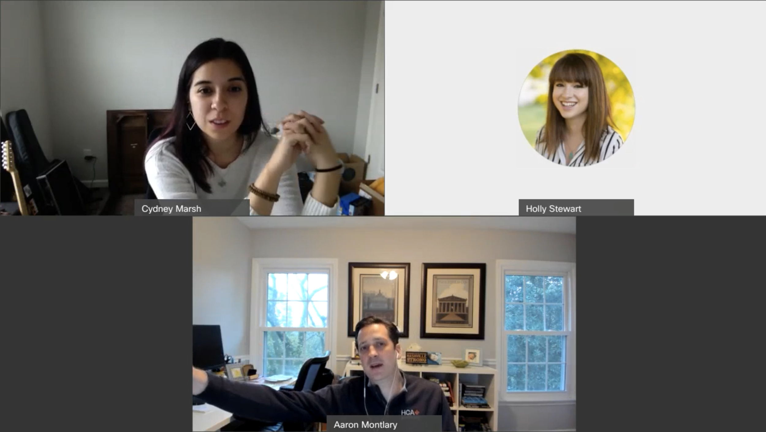
To align Inspire 2.0 around real employee needs (not assumptions), I led 10 moderated interviews across the organization using a consistent guide. These sessions were designed to capture both the business intent behind Inspire and the day-to-day reality of how frontline staff actually communicate.
We focused on goals, pain points, success criteria, and prioritization. To benchmark perception before we moved deeper into design validation, I also captured lightweight 1–5 ratings on Ease of use, Usability, Clarity, and Visual design. This gave us both narrative insight and a directional baseline to validate against wireframe testing later.
Participants
6 corporate stakeholders (clinical innovation, HR comms, internal comms, product/analytics, design leadership)
4 division specific power users (nursing informatics + strategic communications), one from each primary market: North Texas, South Atlantic, Mountain, East Florida
What we focused on
Core jobs-to-be-done: what employees need at the start of a shift
Context of use: time pressure, interruptions, device access
Trust + security expectations: “official” communication vs. external tools
Information architecture: how content should be organized based on existing patterns
Usability Avg. Rating 2.5
Posts truncate at 280 characters, including URLs, blocking planned communications
No URL shortening or link analytics, increasing friction when sharing content
Career Pathways felt unfinished: bugs, poor local relevance, unclear mentor tracking
Mentor/mentee requests often unanswered, reducing confidence in app
Better photo/video support as it was perceived as broken
Missed-content email digests for grouped notifications
Clarity Avg. Rating 2.7
Error messages lack meaning, even when nothing is wrong
Icons without labels confuse lower tech-literacy users
Form questions often unclear; yes/no checkboxes preferred
Ease of use Avg. 2.7
Inspire perceived as a “Swiss army knife” with unclear primary purpose
Strongest value seen as communication, but competing features dilute focus
Tags for relevance based on market and job type
Visual design Avg. Rating 3
Excess whitespace reduces scannability
Notification indicator too subtle to notice reliably
Favorited facility feeds don’t surface first, breaking expectations
Trust & Faith Avg. Rating 3.7
Users trust security, but not reliability or consistency
Inaccurate job titles undermine credibility
Inspire must work for users without email access
Stakeholders concerned about employees defaulting to Facebook
Suggest groups for joining with onboarding
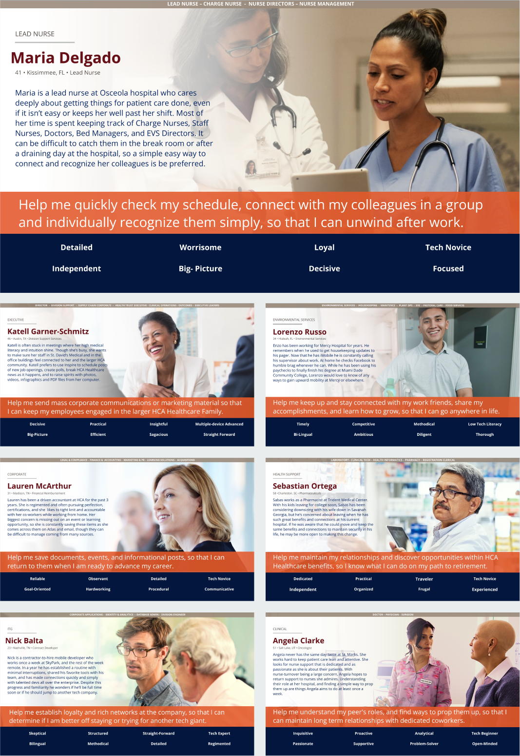
Personas
Based on the findings from our stakeholder interviews, a user survey for the live Inspire App, unmoderated UserTesting with 135 employees nationwide, and analytics from both the app and Employee engagement we created pragmatic, role-based personas representing real HCA employees, including:
Nurses and nurse leadership
Physicians and clinical specialists
Environmental and ancillary services
Corporate and executive communicators
IT and contract developers
Across personas, consistent behavioral patterns emerged:
Frontline staff prioritized speed, clarity, and relevance
Recognition needed to feel authentic, not gamified
Users wanted to communicate within Inspire and share content outward to existing tools
Accessibility and legibility were essential for adoption
These insights guided both architectural and visual decisions.
Competitor Pattern Analysis
Interviews revealed employees were already using Facebook and LinkedIn groups to communicate, recognize peers, and share facility updates. One division had even hired an external agency to build their own recognition and career app, creating a direct internal competitor to Inspire.
To understand expected behaviors, I analyzed:
Direct competitors: Facebook Groups, LinkedIn
Internal competitor: division-built recognition app
Indirect comparators: Nextdoor and other group-based communication platforms
This established a clear baseline for what Inspire needed to support to replace existing workarounds.
Key Findings
Notifications needed stronger visibility and structure
Competitors grouped notifications and clearly showed recency
Inspire’s subtle indicator made users assume nothing had changed
Feed interaction patterns fell below expected social standards
Users expected reliable media, longer posts, and clean link sharing
When posting failed, employees defaulted to external tools
Groups were essential—but needed to reflect real workplace structure
Highest demand was for groups by unit, facility, and role
Competitors supported easier group discovery and cross-posting
Recognition needed to feel credible, not gamified
Badges alone felt performative and were often ignored
Recognition tied to real people and stories drove engagement
Navigation needed clearer hierarchy and accessibility
Competitors used stronger visual signals and clearer labels
Inspire’s icon-heavy navigation increased cognitive load
This analysis directly informed:
Wireframe prioritization around feed, notifications, and groups
Removal of low-trust gamification patterns
Improved navigation clarity and notification visibility
Cross-platform designs aligned with established patterns (iOS + Android)
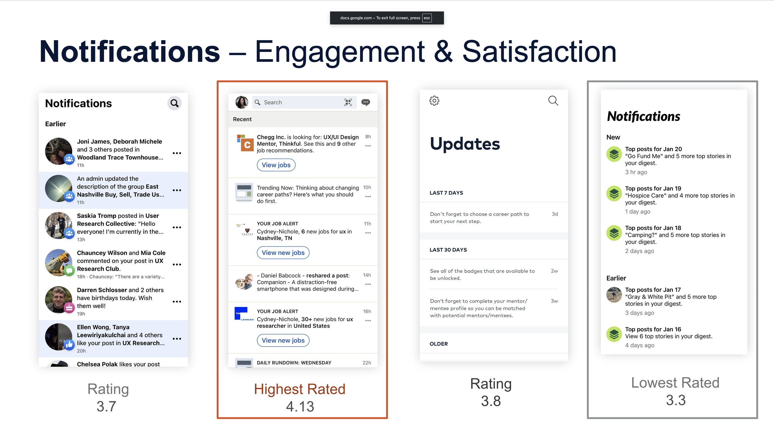
“I have all my notifications set for all my apps, but Inspire doesn’t let you see notifications until you log into the app for the day. If I knew I had a notification I would probably go there quicker. The navigation has a tiny tiny tiny little orange dot that is almost invisible”
Wireframes
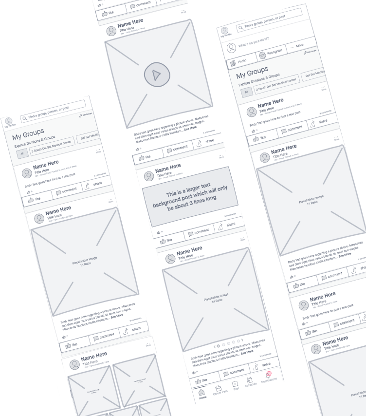
Following discovery and synthesis, I translated research findings into end-to-end wireframes to define Inspire’s information architecture, navigation model, and core task flows.
The goal of wireframing was not visual polish. It was to remove ambiguity: where employees should go first, what actions mattered most, and how different parts of the app related to one another.
I created both iOS and Android versions of all wireframes, accounting for:
platform-native navigation patterns
system behaviors and expectations
accessibility considerations
role-based workflows across clinical, ancillary, and corporate users
These wireframes became the foundation for usability testing, stakeholder alignment, and high-fidelity execution.
These designs also allowed me to introduce new Android mobile design standards to HCA Healthcare. Previously all mobile apps were only designed for apple iOS limiting development and our users.


“Cydney’s research and wireframes gave the Inspire team a clear, actionable direction to follow.
Her ability to translate user feedback and usability findings into strong architectural decisions helped the team prioritize features with confidence.
She laid the groundwork for Inspire’s architecture through wireframes, and her work gave the product the direction it needed for success.”
— Holly Stewart, Senior Mobile UX Designer
Hi-Fidelity
After wireframe validation, I partnered with a Senior Mobile UX Designer to apply HCA’s Neutron design system and translate the approved architecture into platform-specific high-fidelity designs for both iOS and Android.
While hi-fi execution was collaborative, the structure, flows, and platform distinctions were driven directly from my wireframes. I also supported design QA during development to ensure implementation matched intent and accessibility standards.
Inspire was designed as a true cross-platform product, not an iOS-first experience retrofitted for Android.
Rather than forcing visual sameness, the goal was conceptual consistency: users should understand how Inspire works regardless of device, even if interactions differ subtly by platform.
This approach was well received by engineering, who appreciated having platform-ready designs rather than generic comps.

Outcome & Impact
This work helped reposition Inspire as a trusted internal communication platform and influenced broader improvements across HCA Healthcare’s employee technology ecosystem.
Beyond improving Inspire itself, this project:
increased daily usage by 32%
expanded adoption into 3 new hospital markets
reduced support burden by 26%
established Android design standards across mobile products
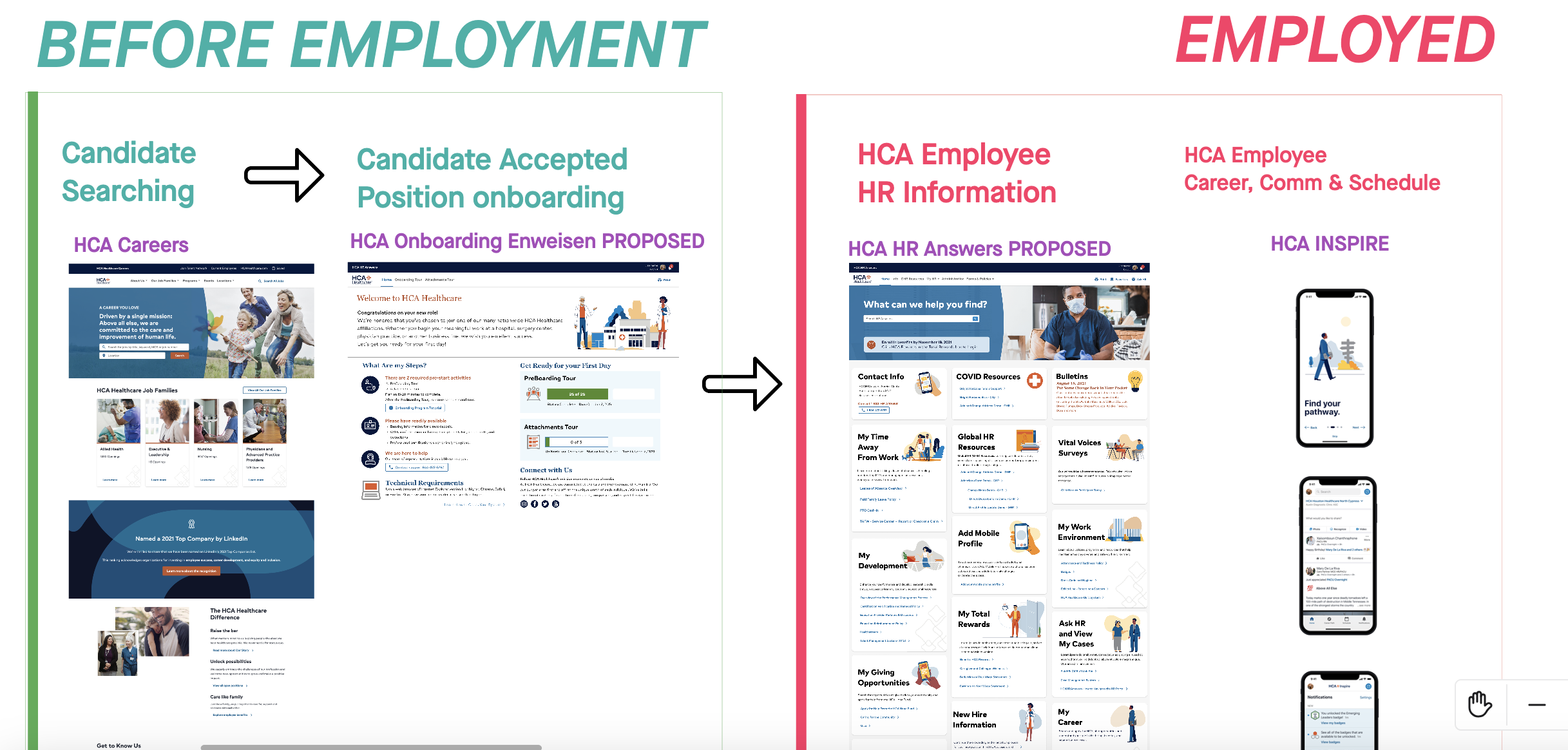
prompted enterprise-wide consistency improvements across HR systems from before employment to actively employed
