UX Portfolio
HCA Healthcare Careers
Overview
Initial Redesign
7 mon. (COVID Chaos)
DEC 2019 – JUL 2020
Revisited Iteration
1 month (2 sprints)
FEB 2021 – MAR 2021
The Problem
With nearly 800k monthly visitors and a high bounce rate, HCA Healthcare’s global careers site needed a full end-to-end overhaul. The Fortune 50 HR Recruitment Marketing team partnered with the UX Center of Excellence to redesign the experience across research, information architecture, content hierarchy, and mobile-responsive execution using the Neutron design system constrained by Talemetry platform feasibility.
Business Impact
We delivered a redesigned mobile-first experience and a follow-up iteration that improved the local recruiting experience. We supported year-over-year performance gains:
+72% traffic to updated job posting pages
+23% average time on page
2x faster page loads
My Role
I led discovery → synthesis → IA → wireframes → validation, partnered on prototype + UI, and stayed engaged through handoff, build support, QA, launch, and iteration.
Deliverables
Stakeholder interviews + baseline ratings
Analytics review (GA + CrazyEgg)
User interviews + applicant survey (UserTesting + SurveyMonkey)
Personas, journey maps, empathy maps, storyboards
Competitor + pattern analysis
Sitemap + tree testing (UserTesting)
Workshop facilitation + dot voting
Wireframes + prototype testing (UserTesting)
Dev collaboration + platform feasibility alignment (Talemetry)
QA + launch support + iteration planning
Meet the Team
-
![A young woman with long, light brown hair smiling outdoors in front of a beige building.]()
Katherine Wright
HR Recruitment Marketing Stakeholder
-
![A young man smiling outdoors in front of trees, wearing glasses and a checkered shirt.]()
Ryan Firm
UX Design Manager
-
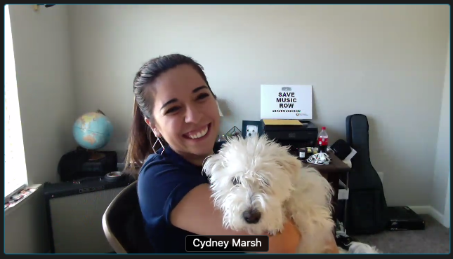
![Smiling woman with brown hair, wearing a black top and jewelry, standing against a white wall with framed art and documents.]()
Cydney Marsh (me)
UX Designer, Lead Research & UI
-
![A young woman with shoulder-length dark hair smiling outdoors.]()
Rachel Waag
UX Designer, UI & Dev Assist
-
![A young woman with long, wavy brown hair and light skin, smiling, wearing a black shirt, a cross necklace, and a large blue earring, standing against a bright teal wall.]()
Cora Rusk
UX Designer, UI & Research Assist
-
![Side profile of a man with short dark hair, facing left, against a dark background.]()
Doyle See
Talemetry Platform Developer
-
![A woman with shoulder-length dark hair wearing a beige plaid blazer and a black turtleneck, looking to the side against a neutral background.]()
Kristin Fowler
UX Designer, UI Assist


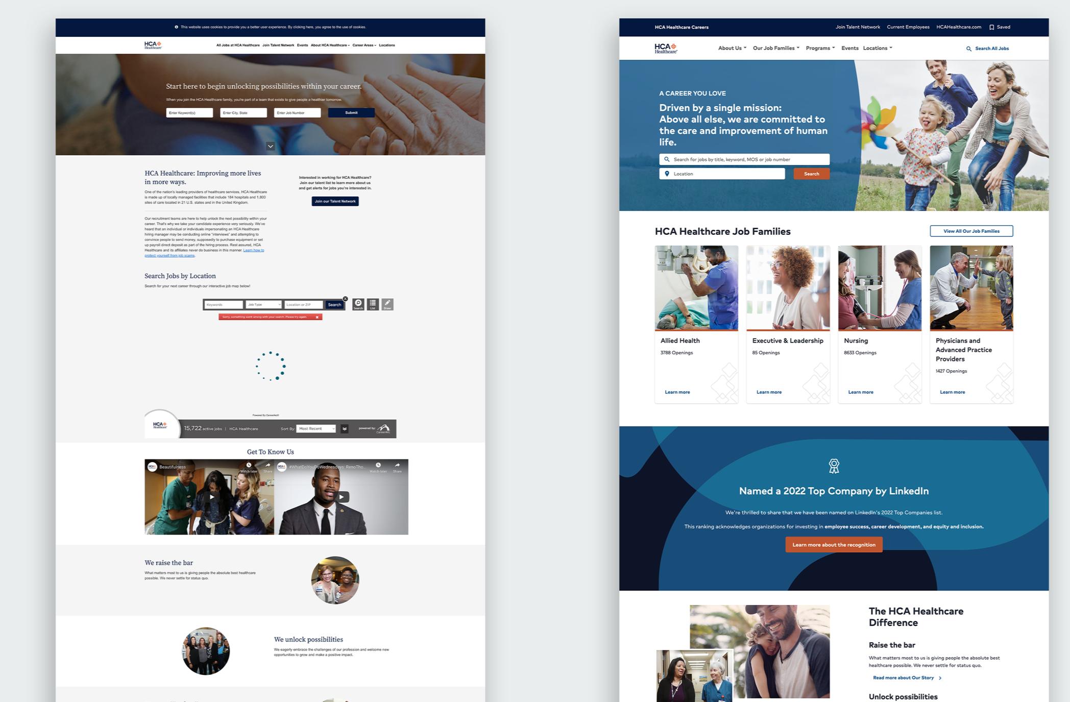
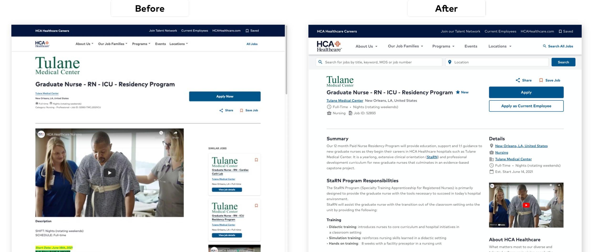
Before vs. After
Critical Questions
The careers site wasn’t helping candidates quickly answer:
“Can I find the right role fast?”
“Why should I trust this employer?”
“What is the culture/benefits/growth like?”
“Does this feel safe, real, and worth applying to?”
Constraints
High-intent candidates arriving from job boards with established search expectations
Enterprise consistency vs. local market customization
Talemetry platform feasibility shaping what we could ship vs. backlog
Stakeholder Surveys and Interviews
At the start of the new year, I and a new UX Designer I was training at the time, Cora Rusk, hit the ground running in discovery. I designed the interview script we used with HCA Healthcare’s Recruiting, HR marketing, and the job platform Talemetry stakeholders. These interviews helped us determine critical user personas to find, high-level objectives, existing site successes to accentuate, areas of opportunity to improve, ease of use metrics to benchmark, competitors to observe, and the stakeholder’s qualitative site ratings.

Key performance Objectives from Stakeholders:
✅ Employee Value Proposition (EVP) needs to be clear and emphasized throughout
✅ The site should build trust and confidence with the potential candidate
✅ Engage the candidates with interaction design, a trim experience, and streamlined architecture
✅ An intuitive conversion-focused site that helps people feel encouraged by the culture to apply
✅ 0 to 1-click job search with filter options accommodating both the candidate and the recruiter
✅ High-impact content that is inspiring, informative, expressive, entertaining, actionable
✅ Diversity and inclusion initiatives need a showcase on the site.
✅ Customizations to tailor small markets while balancing consistency within an enormous legacy corporation.
Current Usability Avg. Rating 3.1
Excessive search glitches
Long page loads
The “Talent Network” link was ambiguous
Legibility of lengthy pages needed improvement
Provide more areas for Infographics and local market content
Current Site Structure Avg. Rating 3.1
Lengthy top navigation link verbiage
Terms and lingo that did not match candidate vernacular
Severe lack of landing page CTAs
Inability to search for multiple cities/locations or remote at once
The journey of reaching a job posting toppled over 4 clicks at best.
HR & Culture Content Avg. 2.8
More visuals and videos could be present
Career programs are too underrated and buried within the site
Build candidate trust with testimonials.
Due to an increase in job scams, social proof would be necessary
Genuine imagery featuring warm and candid faces
Visual design Avg. Rating 2.6
Outdated appeal
“cold hand” zero personification images too prevalent.
Stakeholders desired Lifestyle candid imagery
Extremely verbose pages, inaccessible cognitive overload
Adding HCA’s branding in a way that still balanced individual market brands
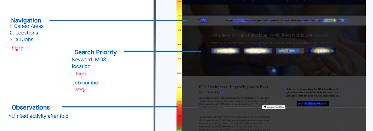
Analytics
Crazy Egg heatmaps showed the landing page’s dominant interaction was job search, while engagement below the fold was minimal, especially across benefits and culture.
Cross-referencing Talemetry source data suggested many candidates arrived from third-party job sites. Following Jakob’s Law, we aimed to bring expectations for a familiar, consistent search experience .
HCA Careers Landing page Dec 2019 - Jan 2020
Decision: Keep search interaction patterns consistent to reduce candidate fatigue, and use selective visual contrast to spotlight EVP, culture, and trust signals.

Job Search Heat Map - Search functions received the most action. Not the results, or navigation.
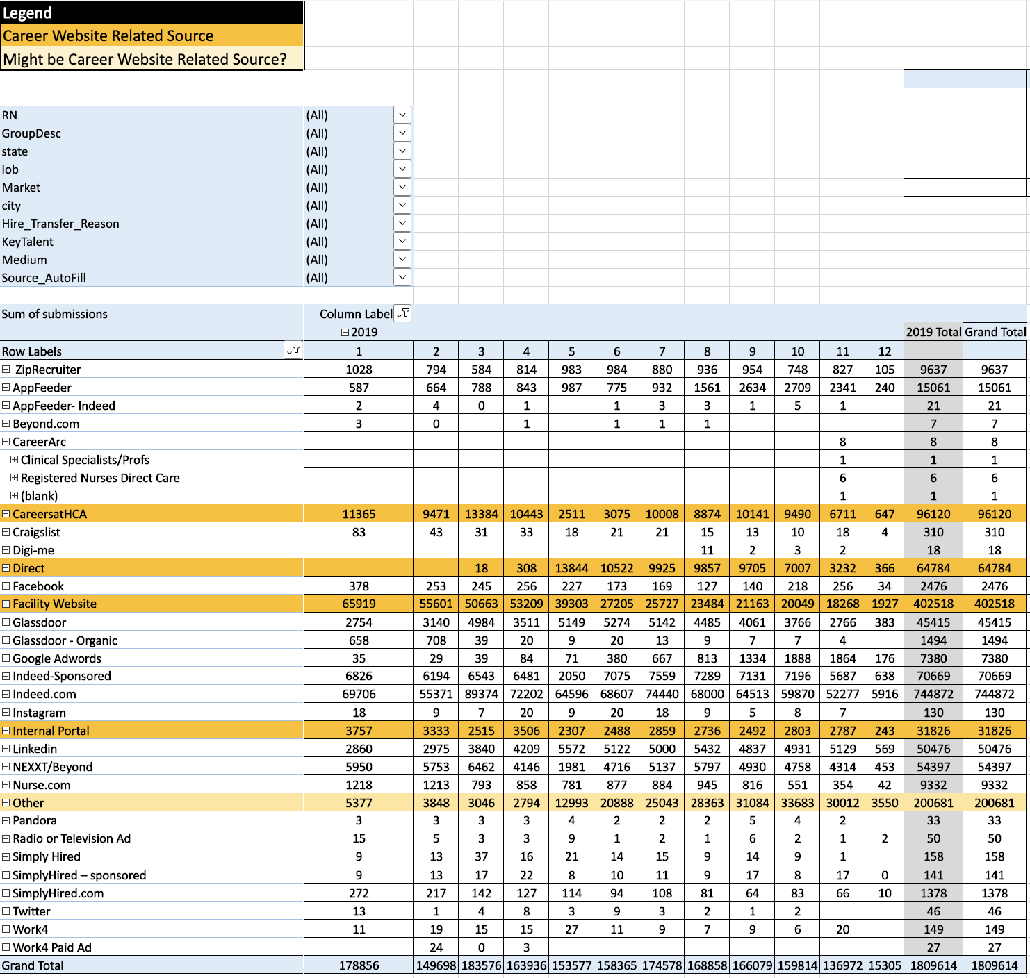
Application & Hire Source Report for 2019 - high usage from third parties
Job searching often takes weeks, if not months, for a candidate. Our takeaway was to remove any functional design variability of our site during that tiring term to not contribute to their fatigue. However, we would only be consistent in the job search functionality. We would utilize the Von Restorff Effect design variability to highlight our brand and content to make it stand out in a sea of other companies. We also determined we needed to focus on the global enterprise content pages, search, and division location pages for this immediate project’s scope. Due to their large number and variety, the individual job description pages ended up temporarily in the backlog of this scope. Job Description pages got their own focused overhaul later in the iteration phase of this project.
User Interviews & Surveys

We chose to interview two types of “power users” identified by stakeholders for the remainder of January. The first group of users was 5 HCA employees who were recently hired in the last 30 days. We asked them about their recent experience applying and any other sites they used in their job search before settling on HCA. We also asked task-based first impression questions to benchmark the site’s current state. We needed to learn why these recently hired employees ultimately chose our corporation over others. What made us stand out in the sea of other hospitals or companies?
The second group was 6 HCA Recruiters for particular departments. We asked them about their experienced tailoring market brands within the large legacy corporation. We wanted to know what tactics worked best for them in getting candidates to feel the warmth of their small community while still bridging the support of the enterprise. This second group also interacted with the candidates the most. We asked the recruiters what they had heard about the candidate’s user experience from their close perspective.
Aside from moderating and drafting the user interview script, I also crafted an anonymous 10-question survey on Survey Monkey that was emailed to recent applicants on the site. These 2 types of user interviews and the qualitative survey helped us gather our personas’ likes, dislikes, needs, and competitors. This info also came in handy for the later competitor pattern analysis.
What we learned from candidates + recruiters
Candidates want speed first, then proof: “Why here?” (culture, benefits, growth, trust)
Recruiters need enterprise credibility and local warmth.
The site had to support both without fragmenting the experience.
Personas
Before configuring the new architecture and laying the groundwork for design ideation, we identified 7 types of personas in various verticals:
Seasoned Nurses in multiple units
Students Entering Workforce (both healthcare or office interns)
Allied Health Support (Pharmacy, Techs, etc.)
Ancillary Support (Environmental Services, Mechanics, etc.)
Recruiters in multiple communities (not pictured right)
Corporate and IT job seekers
Enterprise Leadership

Due to the unique nature of securing residencies of doctors, practicians, and physicians, these personas were not heavily regarded in this effort. However, HR Marketing is currently working on the distinctive user experiences of doctors and their “Practice with Us” landing page on the HCA Careers site in 2022.
Journey Maps

We started our Journey Maps by focusing first on the Experience map of our primary persona, the New Student Nurse, before repeating the same process for the other personas.
The experience map pictured showcases Maria’s job search journey in and outside of her first encounter with HCA’s Branding and services. We captured the beginning emotional rollercoaster of job searching well before she would be interviewing or deciding on a job offer.
While we identified the highlighted steps a user may take in a wide-sweeping experience map, I also detailed the emotions, thoughts, and observations in empathy maps for each of the phases in the experience (below). This helped communicate to our stakeholders the current qualitative state of the site, where unsatisfactory moments occur, and why.

Storyboarding
The Current State Story Board helped us identify the areas of poor engagement, information, and the unfortunate amount of clicks it took to complete a task. We started using screenshots of the current UI to showcase what the user was interacting with during each step along the journey.
I then partnered with UX Designer, Kristin Fowler, to create an Illustrated Storyboard to capture the high-level process users were encountering in the same interaction points. We could easily see points of interaction that could be streamlined as low-hanging fruit. The hand-drawn current state helped stakeholders capture the big picture pitfalls of the site as it existed current in multiple critical tasks.
Using the same hand-drawn illustration style, we constructed the ideal journeys of different tasks. To bookend discovery and fade into ideation, the Ideal State Story Boards helped support our heuristic suggestions and changes in site mapping later.
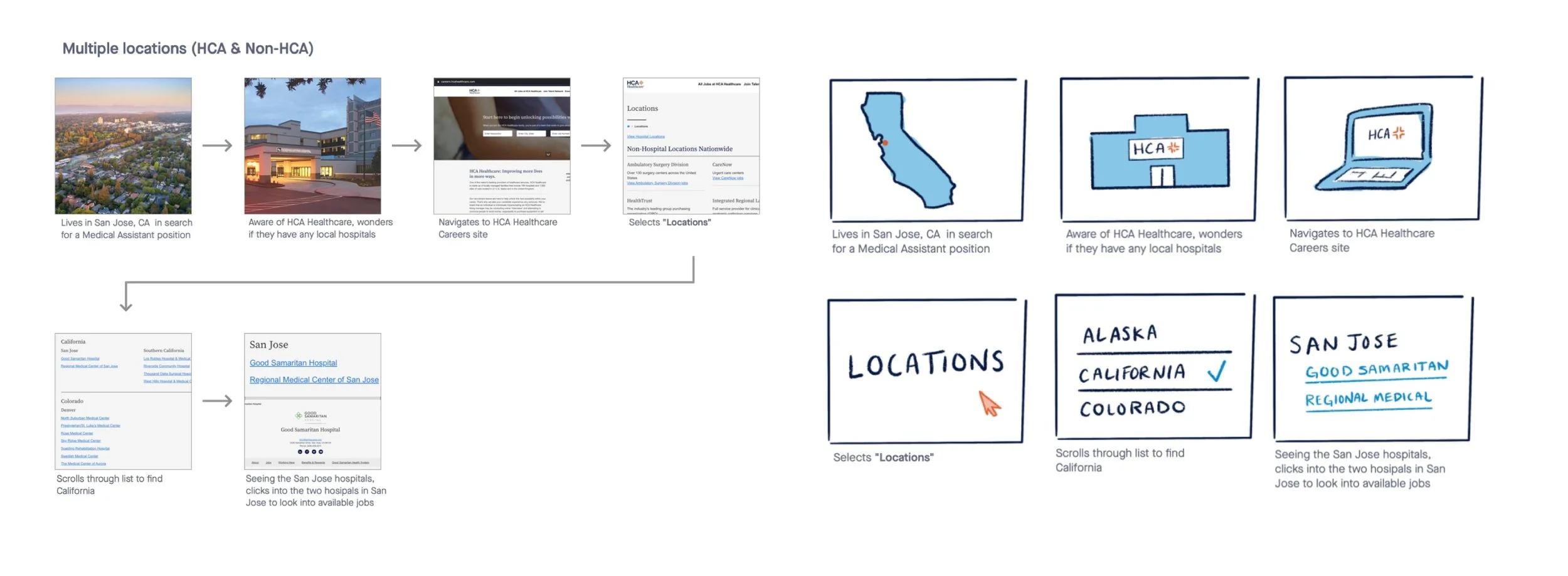
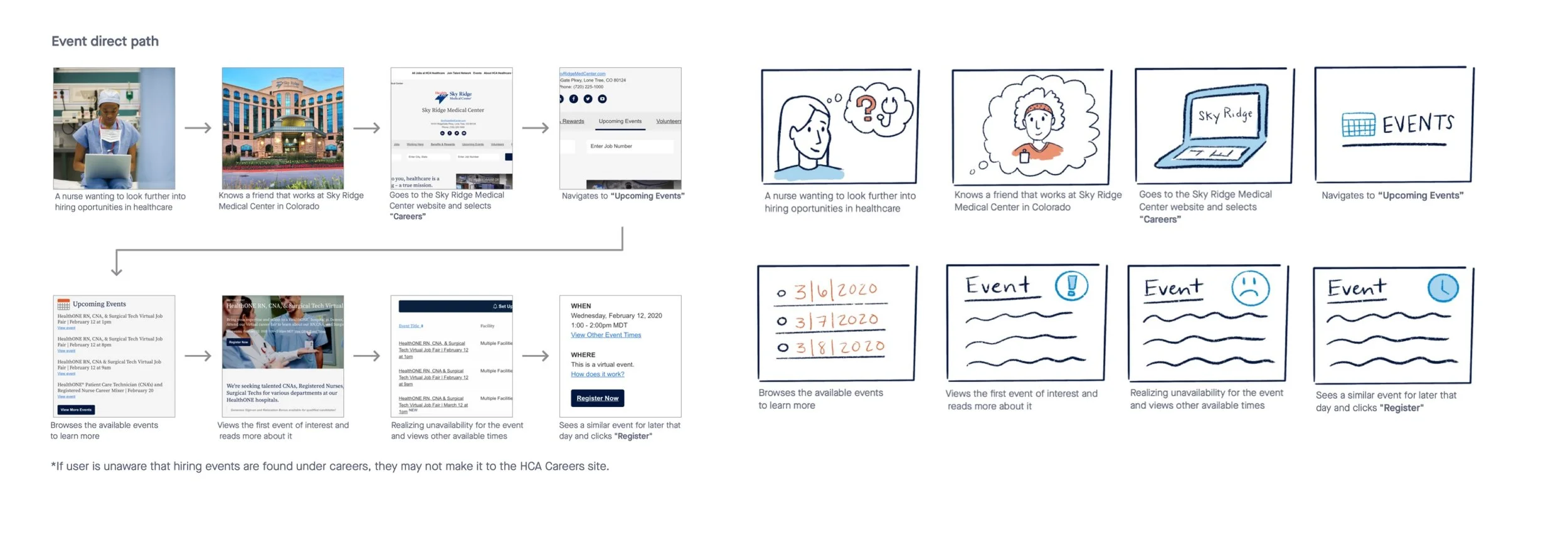
Current State Story Boards 2020
Competitor Analysis
To establish site architecture and get design inspiration, we looked to the current market of careers sites—both direct healthcare and indirect competitors.
Healthcare adjacent industries (Urgent Cares, Hospice, Wellness Companies)
Warm Hospitable Tone Multi-branch corporations (Hotels and Home brands)
Well known Tech Companies
An immediate focus on companies who built their careers sites on Talemetry
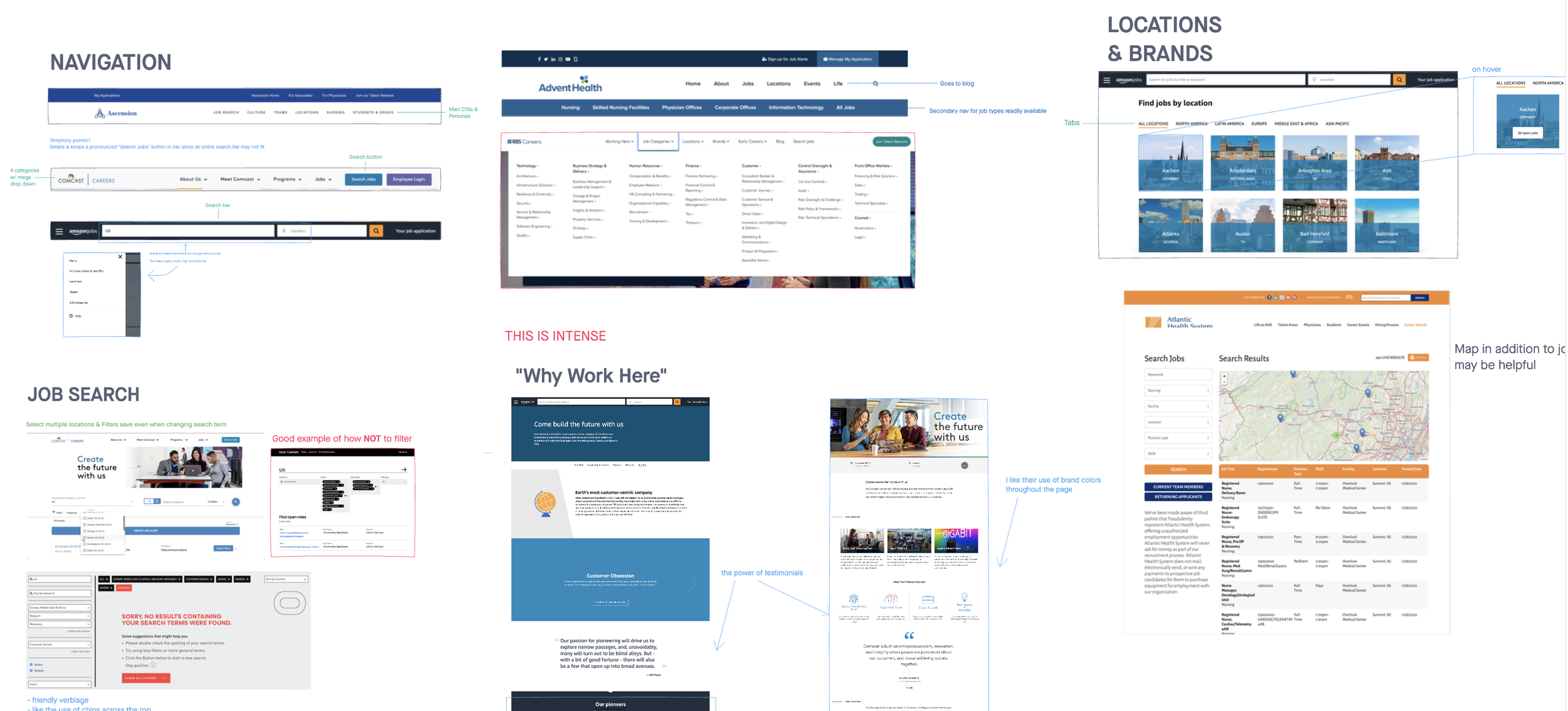
We scoured 24 direct and indirect competitors such as AdventHealth, Ascension, Tenet Health, United Health, Comcast, Amazon, etc.
This study uncovered how other companies handled the functional design of general tasks and critical objectives. We examined job search orientations, approaches to displaying multiple locations or brands within a single corporation, landing page strategies, and site tone. We also considered common copywriting language, image styles, and video topics.
Key Market Analysis Takeaways
Search: do not hide the search behind a navigation tab; keep it front and center by promoting search opportunities throughout the entire site journey.
Filtering: above-content in the common region of searching frees up the horizontal real estate for job listings. It also utilizes the Gestalt Law of Proximity in its dynamic updates below and Hick’s Law to break up more expansive filters until the user is ready.
Personalization: Showcasing a job search “by your interests” and having the ability to save jobs without logging in enhanced the experience with Goal Gradient Effect. Also, including features like an intelligent chatbot made the job hunt more intimate.
Culture & EVP display: sites we recognized as having greater strength in these areas included testimonials, authentic videos, and candid warm imagery. They also had an engaging employee benefits page and presented reviews to provide trust in social proof.
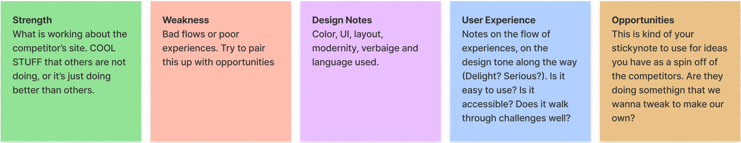
S.W.D.UX.O Method- Strengths, Weaknesses, Visual Design, UX journey notes, Opportunities.

Sitemap Proposal
Now equipped with through research and early ideas flowing, UX Designer Rachel Wagg and I took a moment to make a first draft of the new site architecture. We used GlooMaps to develop our proposed map. At a very high level, determined what the primary paths of the site were and the routes they created to one another. We altered the main navigation's UX writing to match user linguistics and swapped the lengthy labels for shorter, more straightforward verbiage. Additionally, we condensed content by organizing pages that were similar into groups. Our partners came into GlooMaps to make notes, link to other pages stakeholders were aware of outside of the site, and modify the map, offering a wonderfully collaborative experience. After a successful tree test with users, we proposed a slightly iterated finished sitemap.
Lengthy and Verbose Sitemap Before Edits
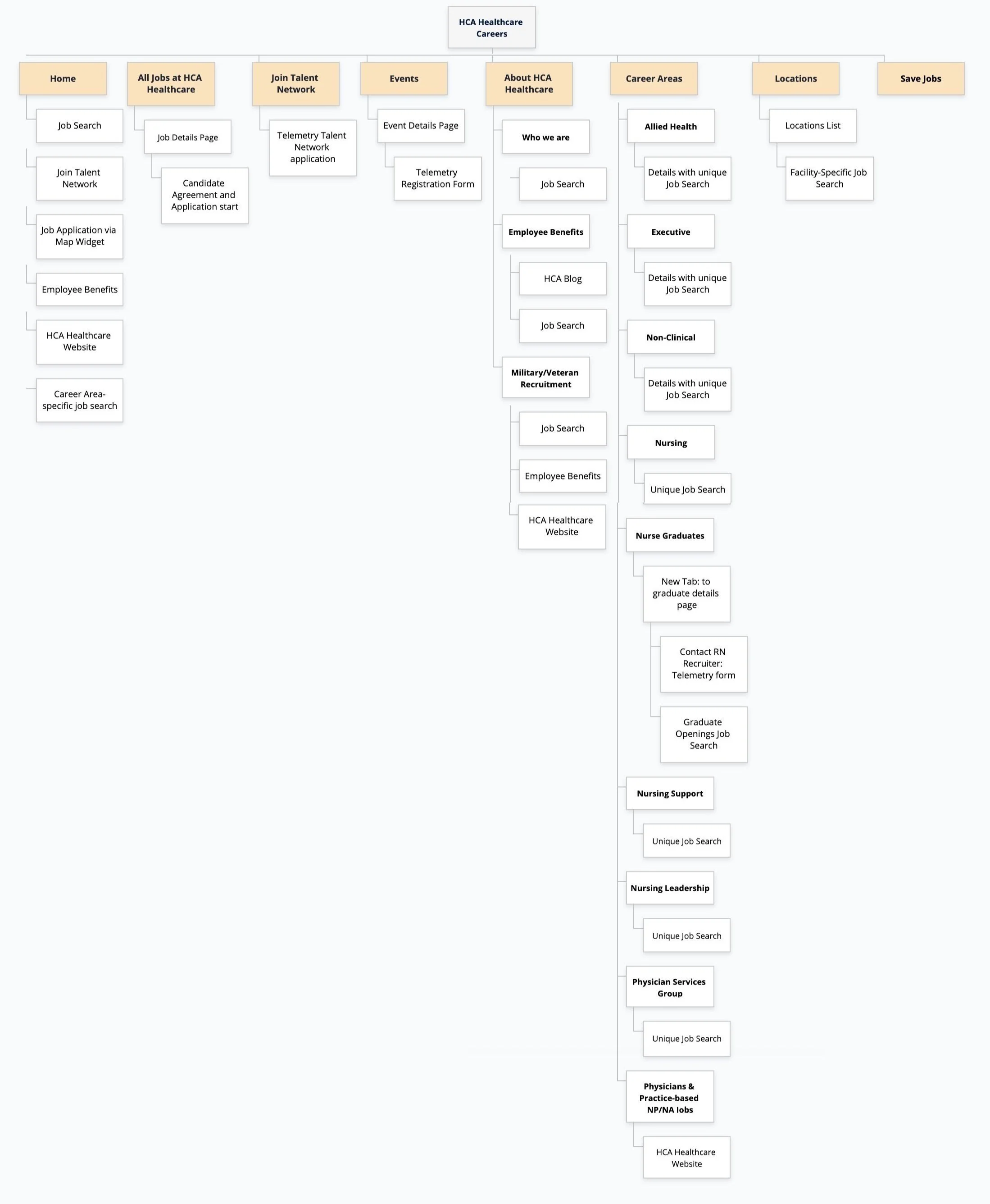
Simplified NEW and Improved Sitemap

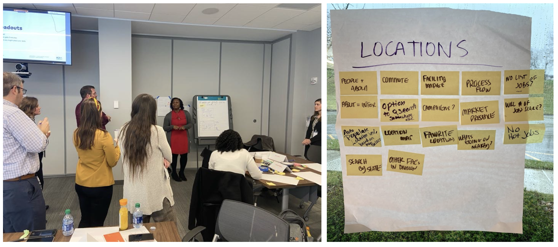
Design Session Early Wireframing
We asked our stakeholders, business partners, and recruiting power users from all over the country to come and collaborate on early ideation in an in-house design session. All hands were on deck, making 8 teams of 4 that wireframed a page in 5 phases over breakfast. We handed folks a sticky note pad and 3 sheets of printer paper labeled Events Page, Location Page, and Interests page. They slapped sticky notes down to brainstorm a list of the content and features they thought each page should contain as a team.
Groups decided which of the pages they would like to sketch out. Then participants were asked to pop open a marker and independently scribble out a wireframe for 15 minutes on their own 11x17" paper. When the time was up, participants shared their wireframes in a quick speel amongst their group. This short round-robin show and tell within squads allowed participants to dot vote on their favorite parts of their teammates' wireframes and collaborate on new ideas.
Finally, the teams were tasked to wireframe again, uniting concept sketches into one larger 20x23" Wall Sticky-note pad. When the music ended, a nominated presenter from each squad shared the group's wireframe with the room. After presentations, All participants received only 5 circle stickers in total. They could use these stickers to vote for their favorite components on any group wireframes, thus highlighting what features would be best to include in the next design iteration. We collected the dotted-up group wireframes take with us to formal wireframing.
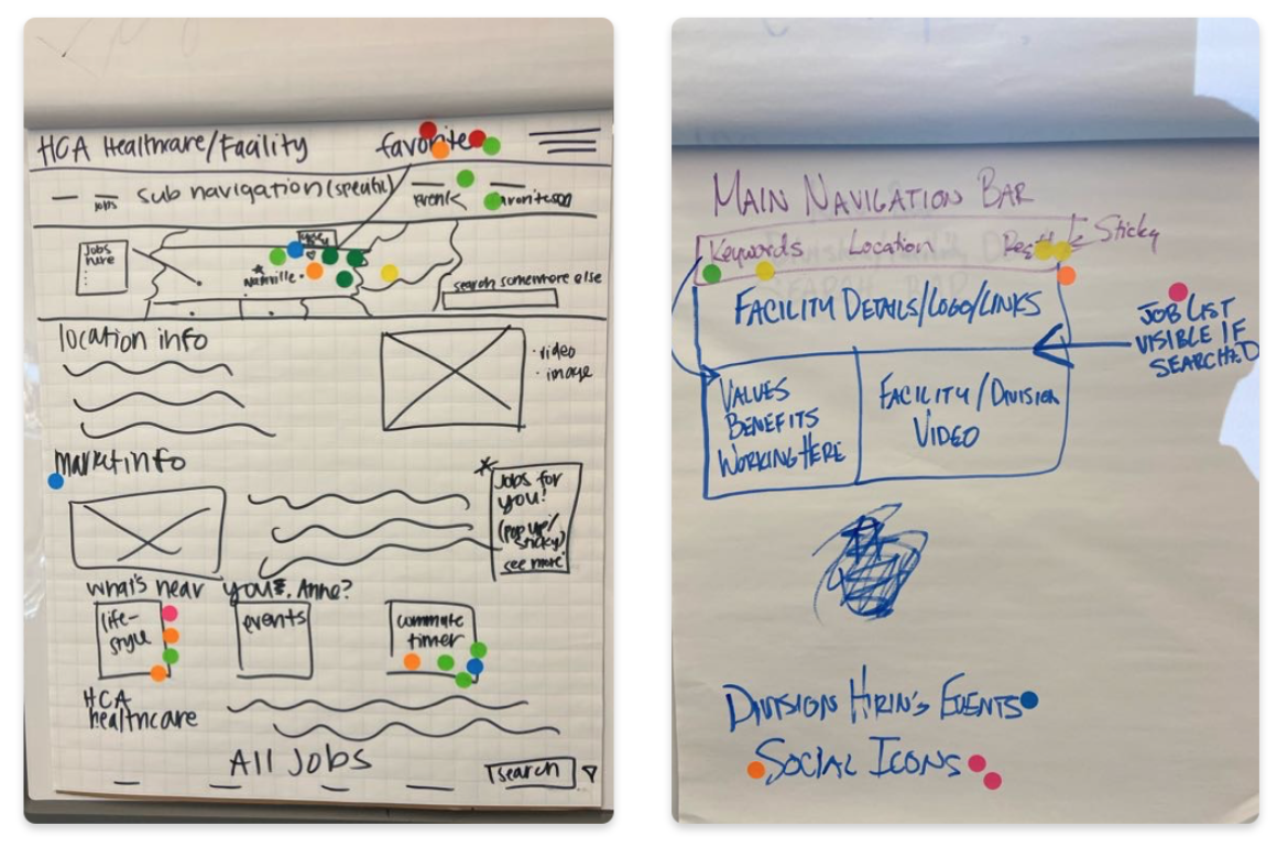
Testing & Finalizing Wireframes
Using InVision Freehand as our flavor of choice, Rachel, Cora, Ryan, and I wireframed formal digital sketches of the entire site. We made a blank frame for each section on our proposed site map. Then we began filing through our takeaways from competitive analysis, stakeholder interviews, user interviews, and the lists and wires from the design session. The initial design of the careers site was starting to reveal itself.
Once we had the screens wireframed, we stitched the skeleton designs with InVision's hot-spotting feature. This method allowed the early blueprint designs to respond just as if they were a fully developed site. This interaction step in InVision helped us gather candid user feedback via UserTesting.com early rather than further down the road in full-color prototyping.
We first presented the user with a cold open screen and asked users what their usual process was like when looking for a job, and what they would expect from a hospital corporation’s career site before revealing the wires. Once the wires were revealed we asked how well the site structure met their expectations, what they liked, disliked, want to be reorganized, changed, labeled differently, and what was missing. We planned content with mostly grey for placement only photo ratios and 80% lorem ipsum placeholder text. We also shared this early wire prototype with our front-end developer at Talemetry, Doyle See. He gave us a direction of features and functionality that may not be achievable in the Talemetry environment and other notes to be cautious of when going into the hi-fi.
“Cydney is an awesome immortal UX goddess by empowering teams with her methodology tips, tricks, and research.
Her enthusiasm and kindness shine daily. Those who get to work with her are constantly engaged, feel prepared, and represented by her lead.
She has taught me so much and added dexterity to my skills as a UX Designer.”
— Rachel Waag, UX Designer
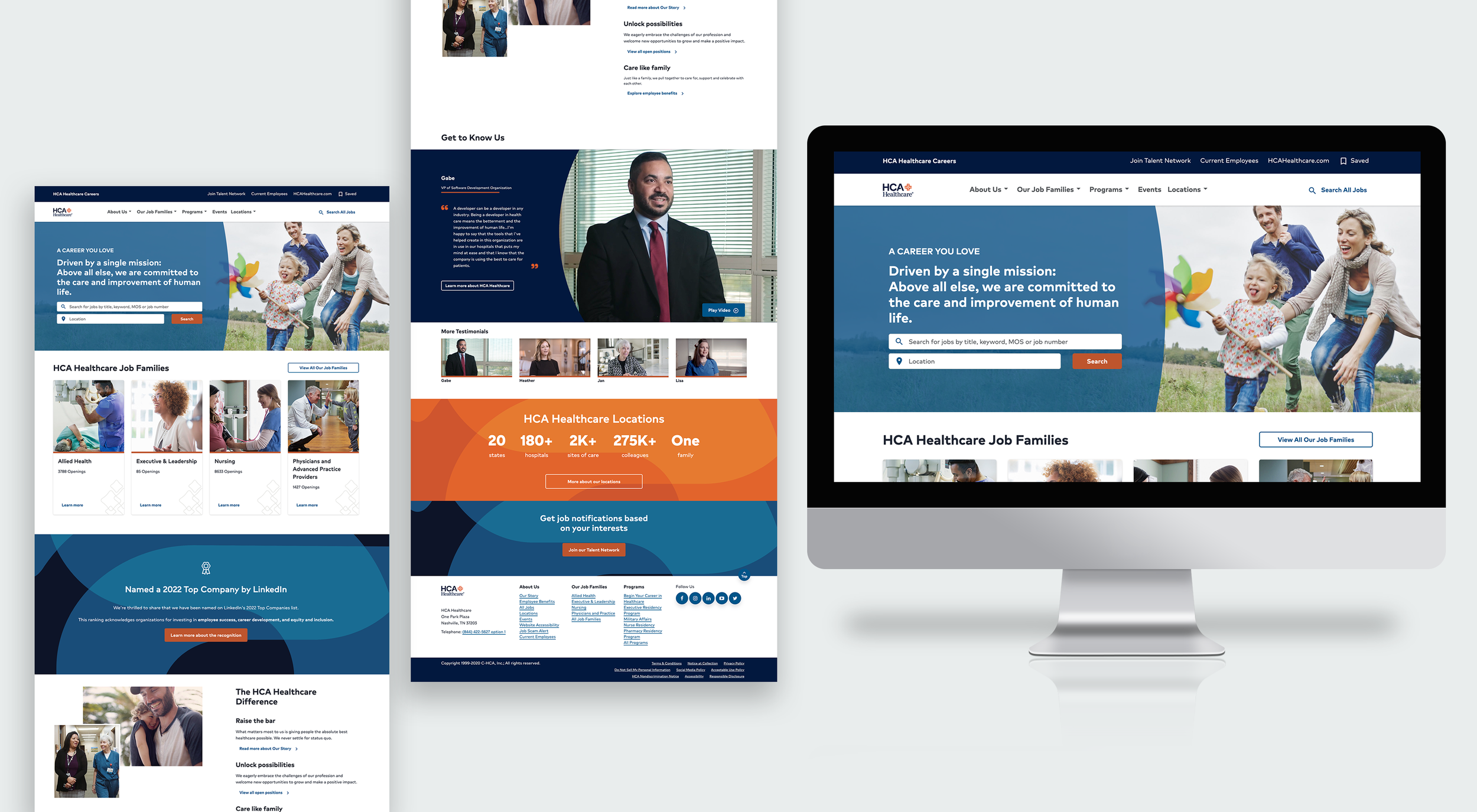
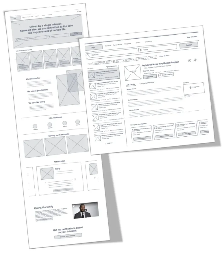
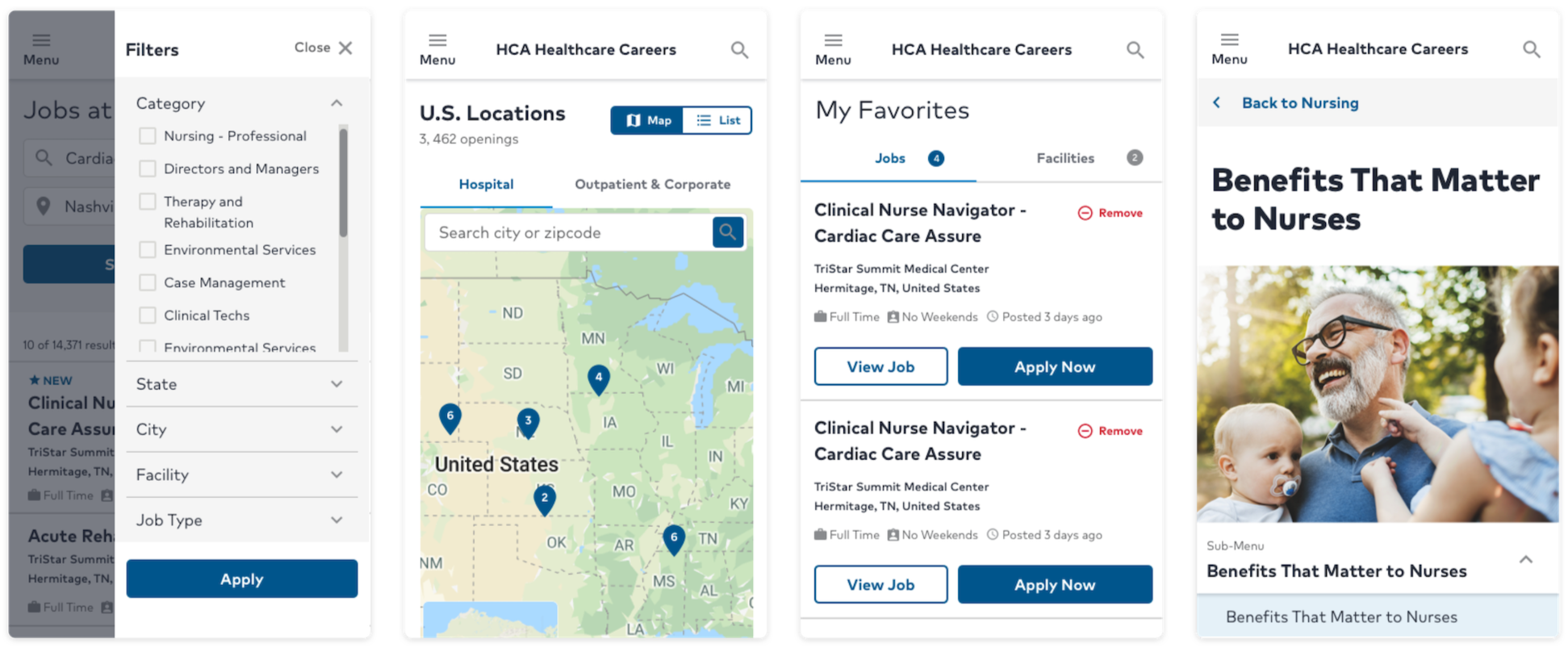
Hi-Fidelity Design
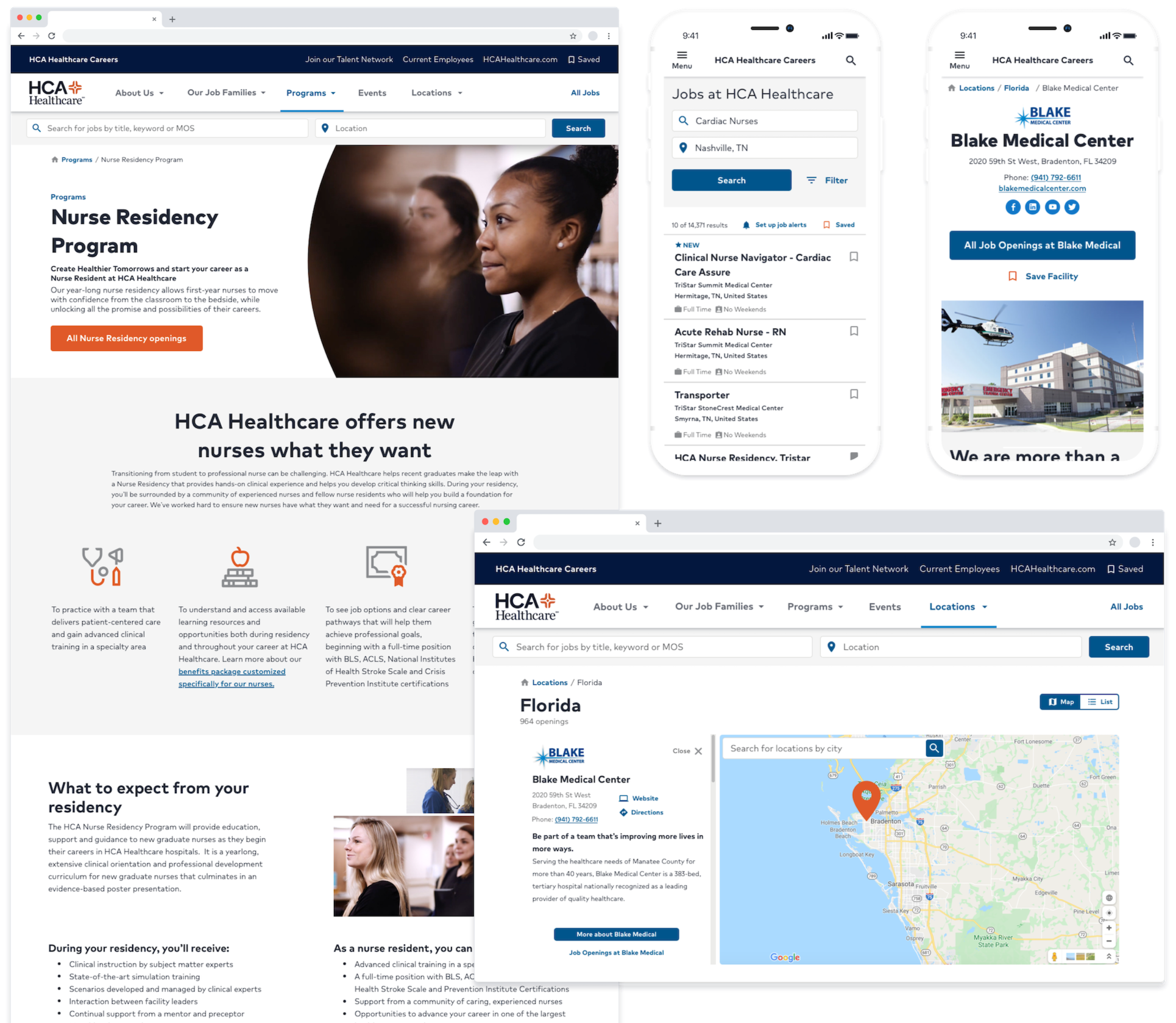
With validated wireframes, we translated layouts into high-fidelity designs using Neutron components where possible, and designed net-new patterns where needed for careers-specific behaviors. We focused on mobile-first hierarchy, scannability, and stronger EVP storytelling without disrupting job search momentum.
We ran additional task-based validation on the hi-fi prototype to confirm: navigation clarity, search and filtering expectations, comprehension of key content, and candidate confidence cues (trust signals, testimonials, Talent Network language). Findings informed final content hierarchy and interaction adjustments.
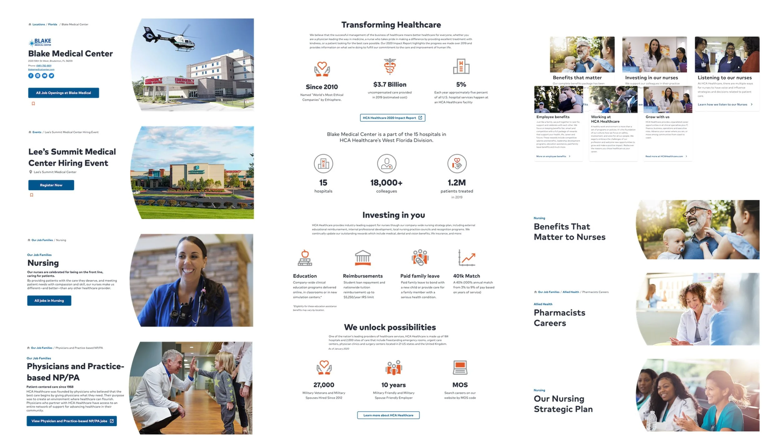
Handoff wasn’t one-and-done. We stayed close with development and HR Recruitment Marketing through implementation, change requests, and ongoing design and accessibility audits to keep the experience cohesive across devices, 900+ hospitals throughout the United States and United Kingdom. To achieve this level of consistency, we designed “App Stacks” for facilities. “App Stack” is an internally-coined term for recurring design patterns that can then be populated by a variety of content within the Talemetry CMS. App Stacks allow for efficient site maintenance after the initial development.
I partnered with development to translate designs into buildable requirements, clarified edge cases, and ensured platform constraints were addressed early. I supported QA by checking interaction details, responsive behavior, and content presentation across devices prior to launch.
We launched the redesigned careers experience and monitored early signals to identify immediate friction and prioritize what to iterate next.
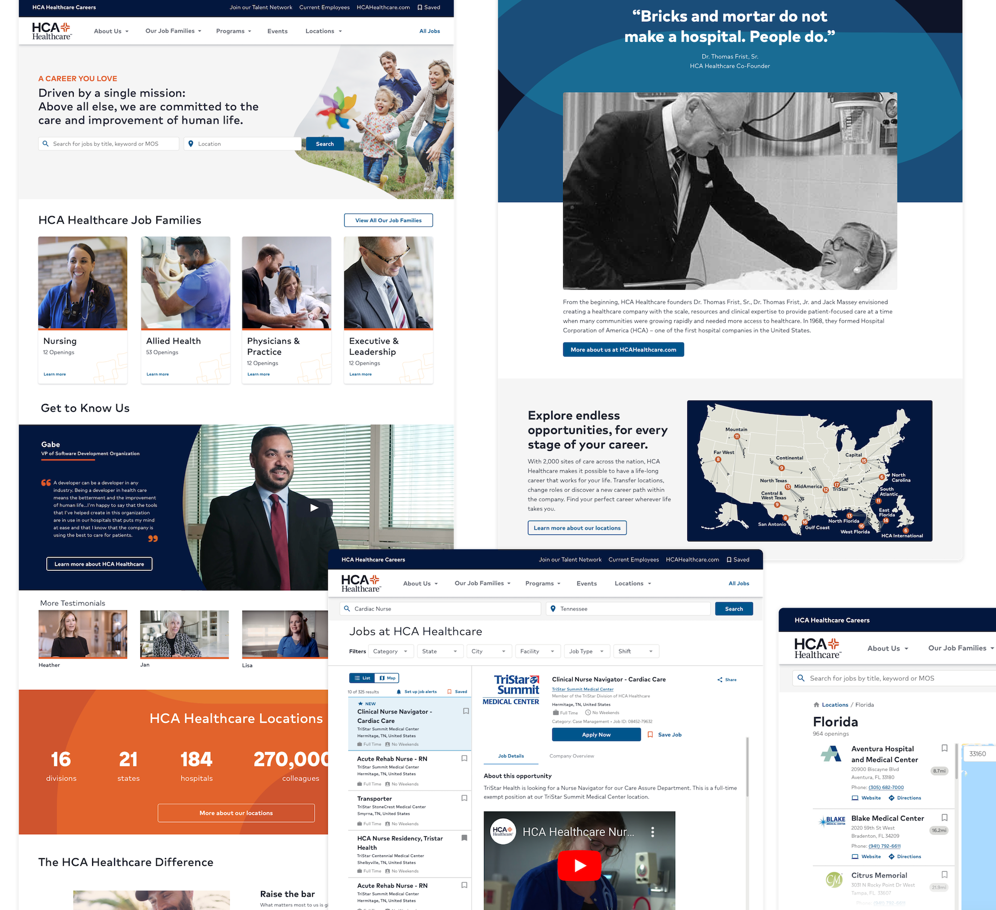
Mobile First UI
Facility Specific “App Stack” Pattern Design
Consistent UI on Launch
Iteration Redefine Local Design
Iteration focus (Feb–Mar 2021)
About 7 months post-launch, we revisited the highest-impact journeys and addressed backlog areas from initial scope decisions, focusing specifically on job description pages. We refined content clarity, navigation findability, and search-to-results behaviors using ongoing analytics and targeted testing.
We surveyed 71 participants who had recently in the last 3 months searched for a job. Ranging from 19 to 67 years old, we received the following information for the job positing design specifically.
Page points of interest
Where and what users highlighted, followed with their cursor or pointed out most often.
Hyperlinks
Bulleted Text
Job Qualifications
Acronyms
Information Recall
What was most and least remembered after a glimpse of an HCA job posting page?
55% couldn't remember benefits, requirements, or qualifications
33% couldn't remember the brand affiliate
88% did not see Equal Employment Opportunity information
55% did remember the city and state
Job posting order of content
Job Description/Summary
Position Type
Job Responsibilities
Critical Skills/Licenses
Education
Years of Experience
About the Company
Benefits
About the Team
Snap study
In one word, what stood out the most?
Long
Informative
Confusing
Simple
Professional
Wordy
Descriptive
Dull
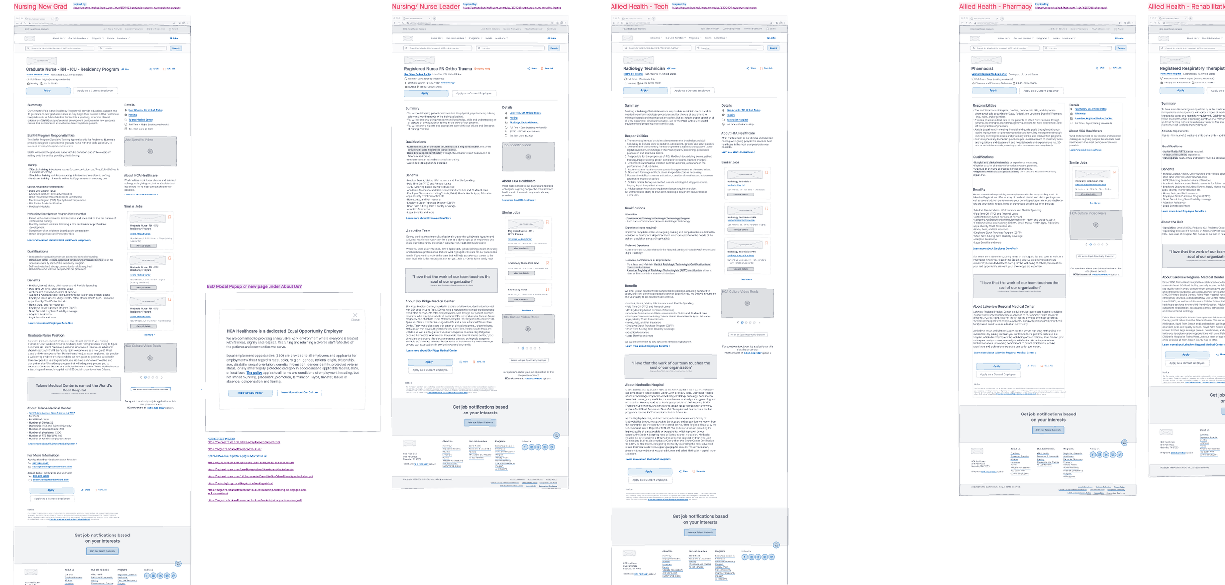
Next, we looked at competitors both built on their own custom platform and the Talaemetry platform. Identifying different job types like nursing, IT, ancillary support, executive roles etc. we analyzed 41 competitors job postings. Below are the most common patterns we saw which we used to define the new and improved Job Posting wireframes and prepped for their hi-fi iteration.
2-column organization
Right-handed content used for additions like videos, similar jobs, FAQs, quotes, and job details
Linked call-outs under the job posting to employee benefits and about us pages
Generic images on the posting page
Link for current employees was apparent
Iconography
96% of competitor job posting did not include benefits within the description
A, B and C Testing
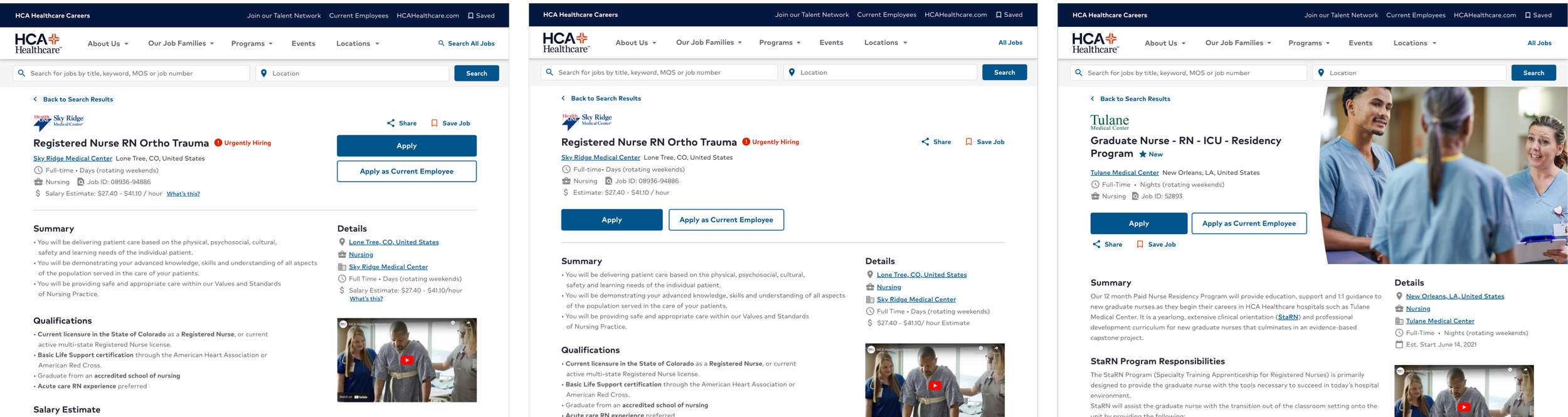
After receiving a great response from the wireframe work, we drafted hi-fidelity designs. Three different header patterns made the final cut so we sent them off to be judges with real eyes. Design A had large CTA buttons on the right, Design B had the buttons on the left with the rest of the content, and Design C leveraged a generic image on the right side of the header.
The final consensus resulted in 78% votes towards Design A.
Results
Three months after this research and design effort, we received positive analytics on the updated job posting page.
72% increase in page traffic
23% longer page time average
2 times faster page loads
Consistent, flat bounce rate