The Human Insights Summit (THiS) San Francisco 2019
Nov 20, 2019 • 9 min. read
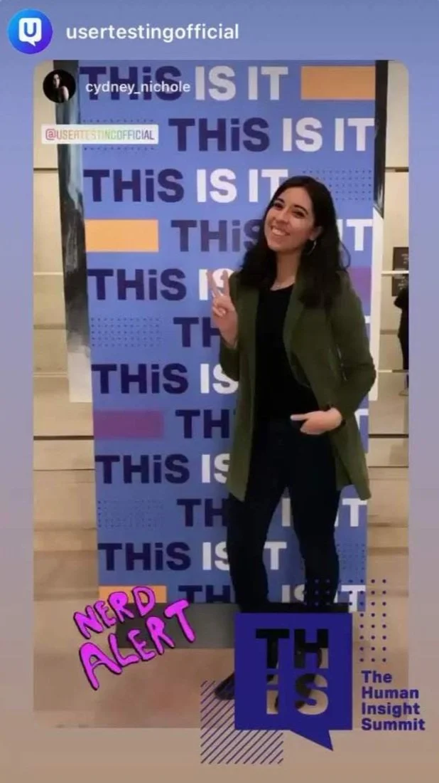
At the end of October, I and many others worldwide arrived in San Francisco to attend UserTesting.com's inaugural, sold-out Human Insight Summit (THiS 2019). THiS is a multi-city customer conference was designed to educate, inspire, and bring together thought leaders who use human insight to empower their businesses; and boy did it deliver!
It was a packed house, but by no means did I leave a stranger to all those in the room like other conferences I have attended in years past. During this one-day event, UserTesting Support Staff and customers provided numerous sessions to share their remarkable implementation tactics and success stories for User Research. They also made a supportive environment opportune for genuine network connections. Since then, I have had a lot of excellent conversations with some of the world’s brightest UXers, Marketing leads, and PMs alike.
Opening Keynote
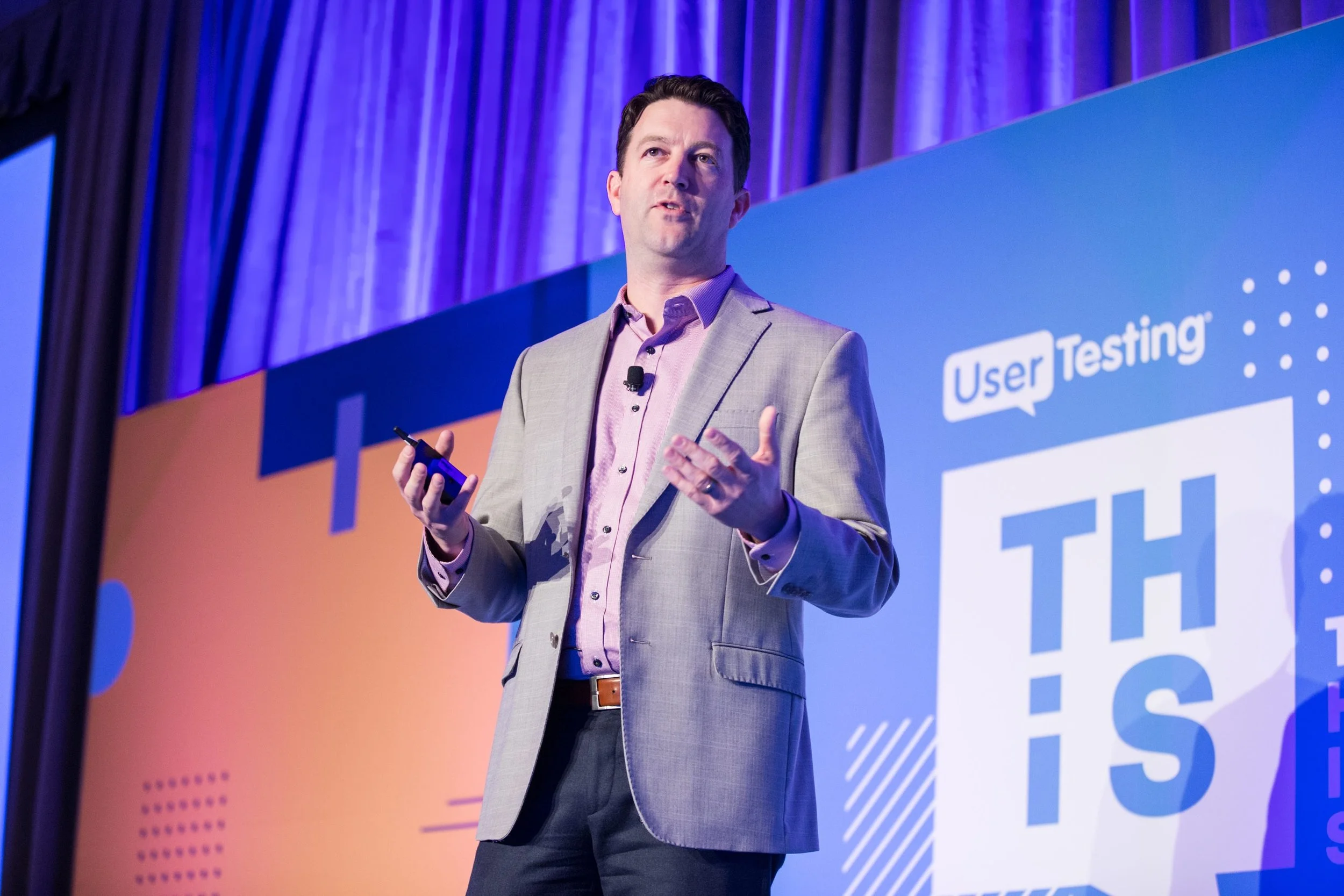
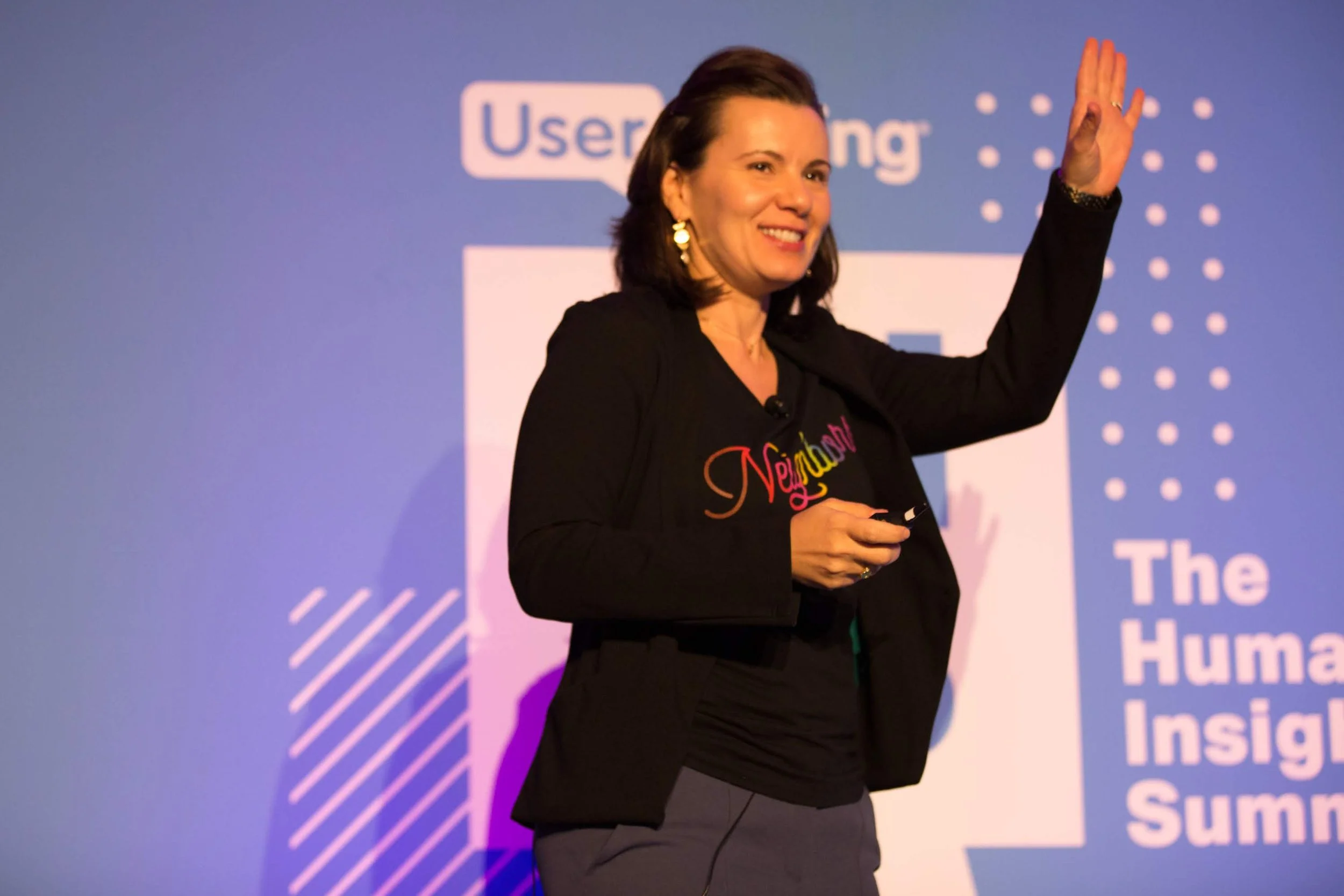
The morning started with a helpful and inspiring opening keynote from their relatively new CEO, Andy MacMillan, on the importance of identifying the most critical human-centered problems quicker. There UserTesting.com also announced its acquisition of machine learning provider Truthlab, which helps UX Researchers like myself uncover key insights even faster by using AI video analytics. Truthlab is the leader in discovering customer satisfaction, retention, and advocacy in the UX industry. I am excited to see where UserTesting.com will take this! While Truthlab is small, they are mighty.
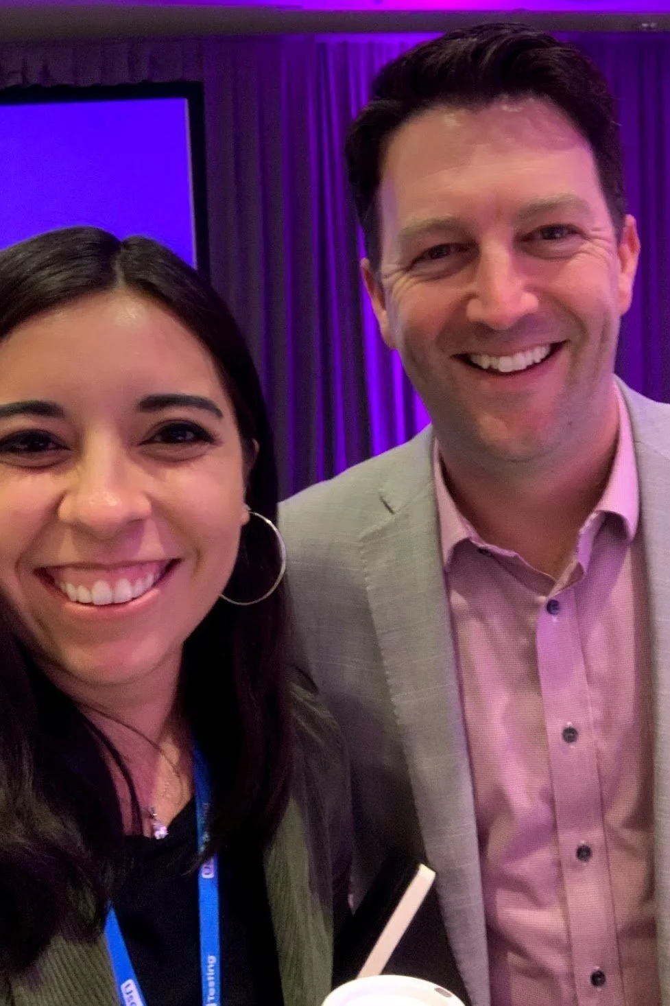
With a bit of small-world humor in mind, I took a moment to finally formally introduce myself to Andy MacMillian after the keynote. Andy and I have known each other for a while, but until the conference, we’ve never officially met in person. His brother, Marty MacMillan of MacMillan Guitars here in Nashville, is my good friend and old Gladeville neighbor.
Andy and I were finally meeting on the other side of the country. We laughed for a while about mine and his sister-in-law Bethany’s Target obsession or his brother’s and my involvement in the Rock by the Sea charity music festival. We also chatted about how I had just celebrated a baby shower for Marty’s new little girl with most of Andy's family!
Before heading into our first breakout session, I gave props to Andy for getting Marty a UserTesting.com study for his boutique guitar website. With five 10-minute sessions, Marty had fantastic insights. Evidently, his brother’s glowing praise of the platform is what finally won Andy over to accept the role of CEO last year.
“If a small custom guitar maker in a cabin all the way in rural Tennessee is surprised by the feedback he receives and improves his business in 2 hours with just 5 quick tests, I figure everyone should be doing this! There's really something in quick iterative research.”
- Andy MacMillan, UserTesting CEO
Story Telling
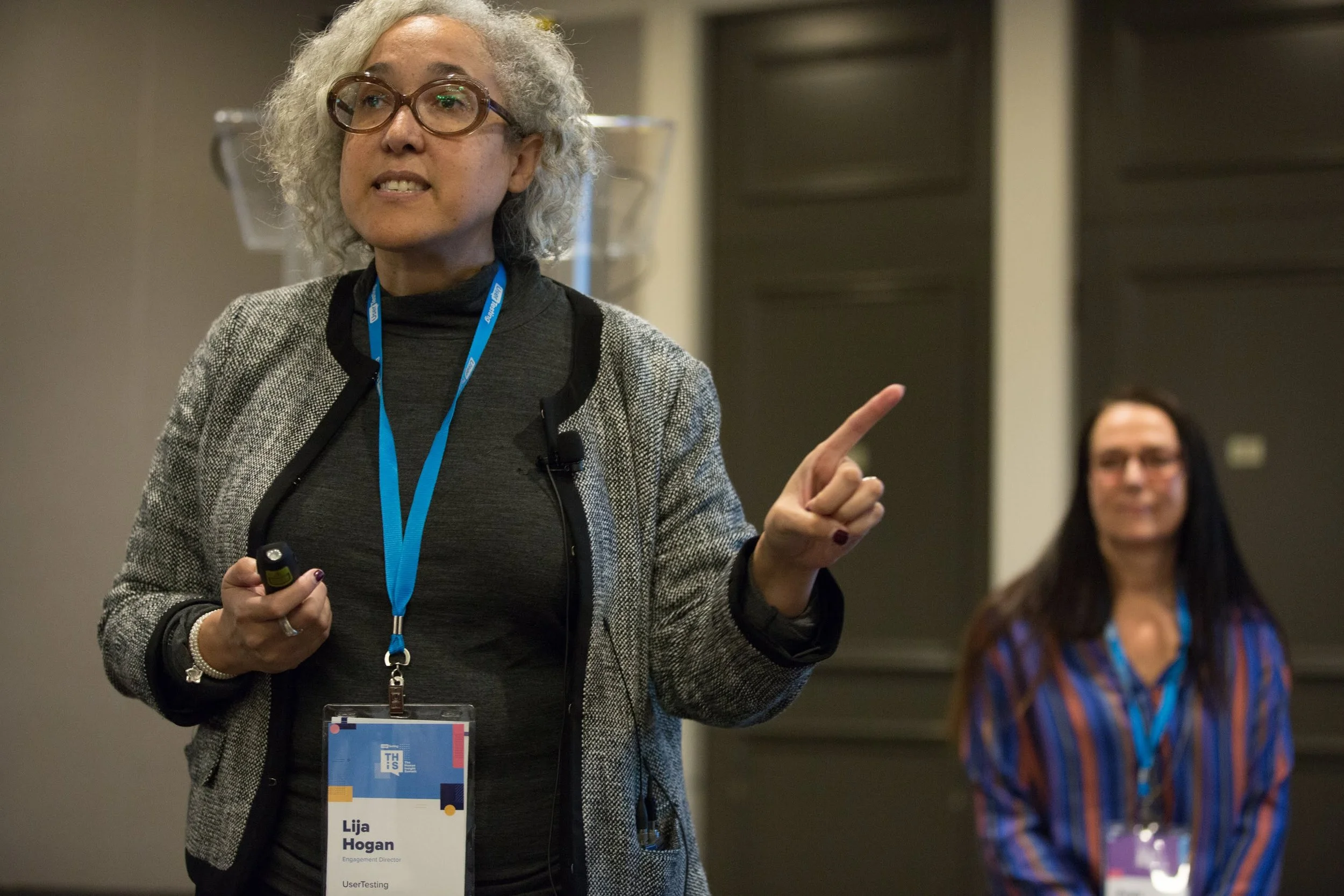
Paula Bach, Principal User Research Manager for Microsoft, and Lija Hogan, Engagement Director at UserTesting and Lecturer at the University of Michigan, taught the first session I attended. The entire purpose of this storytelling course was to coach how to determine which insights were the most valuable for a report with the goal of making the user insights impossible to overlook.
"People don't want to know everything. They only want to know about the one thing they care about"
- Paula Bach, Principal User Research Manager for Microsoft
Paula Bach utilized her most recent case studies regarding Microsoft’s new browser, Edge. She and her team of eight UX Researchers determined through ten UX archetypes which usability testing methods to mix and match to answer all their questions for building a better browser. Both Paula and Lija thoroughly explained a process to determine which insights need a full report and which only require a video to convey findings.
Ultimately it boils down to a 3 step process:
Simplify - Take your laundry list of UX insights and determine which ones the business needs to know first. Which ones matter the most to them of all the facts and findings? Which are the most powerful?
Surface - Highlight contradictions and ID the UX Archetype to make the throughline clear
Show - Use clips and highlight reels wisely, not just words. Use your personas and journey maps in presentations to breathe life into them. Finally, test your PowerPoint or video with a third party to ensure that what you saw in hours of research is conveyed in the report.
If you find creating visuals challenging, Paula and Lija suggested using NounProject.com to determine which visualizations will present your findings best. I am still in contact with Paula, as I have research on asking better quantitative questions than a simple NPS score that will help her and her team at Microsoft. She is sharing best practices on screen for a panel on Low Computing Competence, which I’m sure I’ll find very helpful in my studies.
Lunch Networking
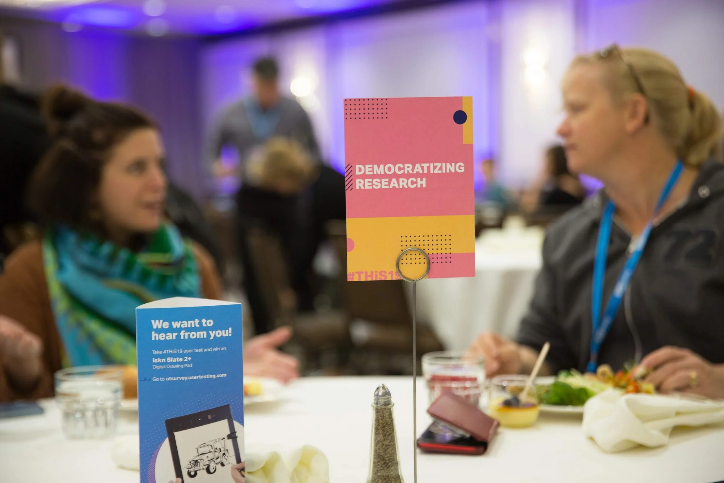
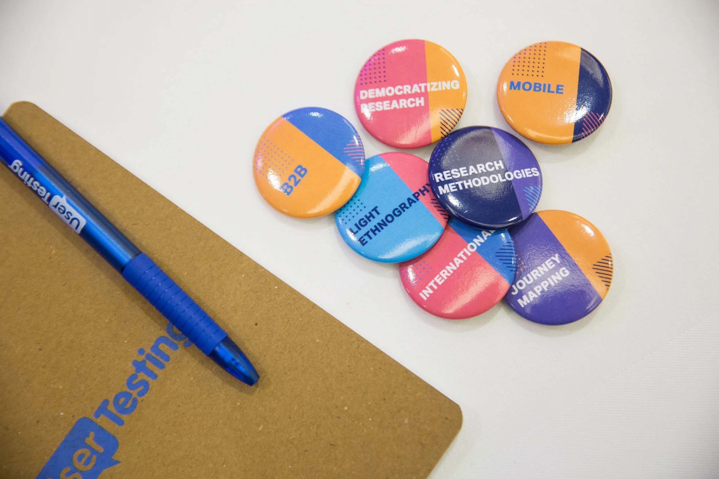
THiS 2019 handled lunch in a way that I hadn’t seen at a conference before. Each table had a topic of discussion in which participants could contribute questions or their expertise. The subjects at hand were: Democratizing Research, Mobile, Design Best Practices, Journey Mapping, Research Methodologies, B2B, International, Light Ethnography, and Tracking Insights. Attendees were also encouraged to grab buttons with the same labels to encourage mingling throughout the event.
With a B2B button donned on, I took a seat at the Democratizing Research table to nerd out with a few Developers, PMs, Product Designers, and UX Researchers from the likes of Google, Target, Under Armour, Punchcut, and a few small agencies. I shared my method for monthly UX Research Office Hours, which, surprisingly, none of them had tried at their companies yet. They all found my implementation inspiring as far as encouraging usability testing culture and as a means to democratize research at their companies. In the weeks since, I know it has helped a lone UX Researcher tremendously at Under Armor, Allison Wechsler. She also happens to be a fellow University of Arizona Wildcat (Bear Down!), so we stay in touch about that over LinkedIn even today once we have exhausted the nerdy topics.
At lunch, I was able to gain insights as to how Google budgets its research from Program Manager Hantz Fevry. I also learned some valuable tactics about testing within a corporation from a Product Designer at Target, who primarily works on Target employee products, not consumer products. As most of my projects lately have been on employees within healthcare, I found her perspective the most applicable to some of my questions.
Qual & Quant Tools to Drive UX Strategy
UX Research Manager for Alaska Airlines, Ona Anicello, taught the second breakout session I attended. She shared two UX Research tools to facilitate a more robust iterative and inquisitive culture.
Create Maps Agnostic of Brand FIRST.
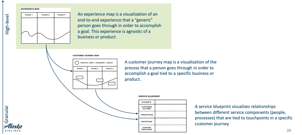
Create experience maps agnostic of a brand to keep you and your coworkers safe from the dangers of being pigeonholed, saying, “This is how we do this because we are Alaska.” You are biasing your solution right out of the gate by saying this. Instead, look widely at a traveler’s experience and the guest’s pain points. The main questions that everyone in the company should be asking themselves agnostic of a brand are: What teams are involved in the experience? What products are included? What other factors do we need to consider?
These three questions will become the three “Swimlanes” on the agnostic Experience map to feed into the “Bridgelane.” The Bridgelane is various possible marketing touchpoints. It focuses on times your brand can enter the experience map, thus creating the “Core Journey Map” or the “Customer Journey Map.” Only at this point in mapping can should you discuss what your brand will do.
From there, you can detail the different processes and services that can come into play on a journey by Creating a Service Blueprint and go more into detail on the user’s mindset with an Empathy Map for each phase of your experience map. All four maps are essential for an exceptional understanding of your user experience. By following this phased approach to branding, you will have both high level, and extremely detailed empathy for your users, agnostically to your product.
2. Keep Track of Research Team Metrics
Each month all eight members of Alaskan Airline’s UX Research team complete a Qualtrics survey to measure the output, success, and impact of the UX research at the company. Researchers record the study name, launch date, hours and number of weeks it took to complete, usability study methods used, common tags and trends that appeared in analysis, who attended sessions by discipline, and the types of impact for every study they completed in that month. They then convert the survey results into a dashboard. This visual dashboard helped Ona communicate with leadership when she needed to hire another researcher. The dashboard has been vital in expressing how much impact research was having behind the scenes at Alaska Airlines. It also helped her team give suggestions to stakeholders on common trends heard in usability studies that might not have otherwise been connected.
Today, the UXCOE is still in contact with Ona. We hope to gain insights into how airline companies handle passenger transfers during emergencies to draw parallels for a Hurricane Hospital Evacuation application we are currently in discovery before designing.
The 7 Habits of Customer-Centric Companies
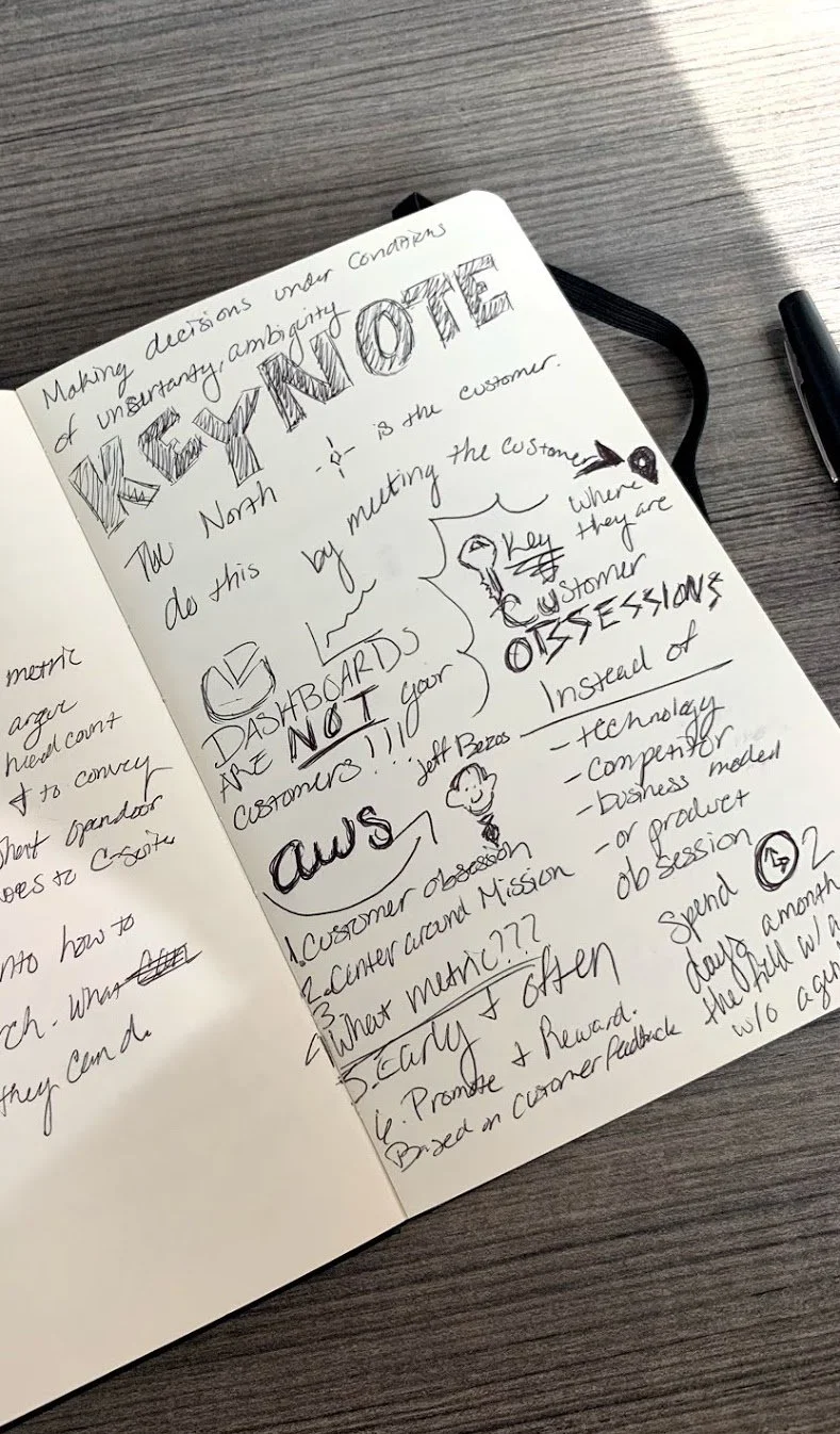
Finally, the closing Keynote by Tatyana Mamut, Head of Product / CPO, Nextdoor, was the most insightful and intriguing as she structured a heavy analogy as a group activity. Tatyana built a boat analogy with 7 Habits of Customer-Centric Companies she had adopted from Jeff Bezos’s business practices. We were to imagine our product team was setting sail on the ocean with a clear project path in mind. However, mishaps would appear at each point in the boat’s journey, such as pirates boarding the ship changing the direction and the goals. At one point, you’re nearing the end of the voyage, and your head engineer says the engine has broken down. You only have enough resources to repair the ship and delay the timeline or throw off half of the cargo initially intended to be delivered.
At each mishap, Tatyana invited us to speak to a partner at our table to discuss how we have instilled or plan to introduce a few customer-centric qualities. My partner was Sharon Su, the Director of Product Management for Employee Interface at Sam’s Club and Walmart. We both shared how sometimes it was difficult for us to make projects “customer-obsessed” as we often deal with internal products. Saying the word “customer” does not necessarily translate well to teams Sharon and I work with frequently. However, “user” doesn’t have the same impact it should either.
Sharon informed me that her current ship mishap was that her team struggled with testing early and often. They often wait until a high-fidelity prototype is designed before talking to a user. I shared with her HCA Healthcare’s standard practice of using InVision Freehand cleaned up wireframes to test a concept first before getting too far down the line. I shared that we typically invite users to draw their expectations in user interviews, have her designers brainstorm a combined wireframe concept or two, then test the wireframes before a user interface is even designed or developed. It was delightful to help another person with a new method and be thanked profusely, and gain her unique perspectives and ideas on the process.
Closing Happy Hour
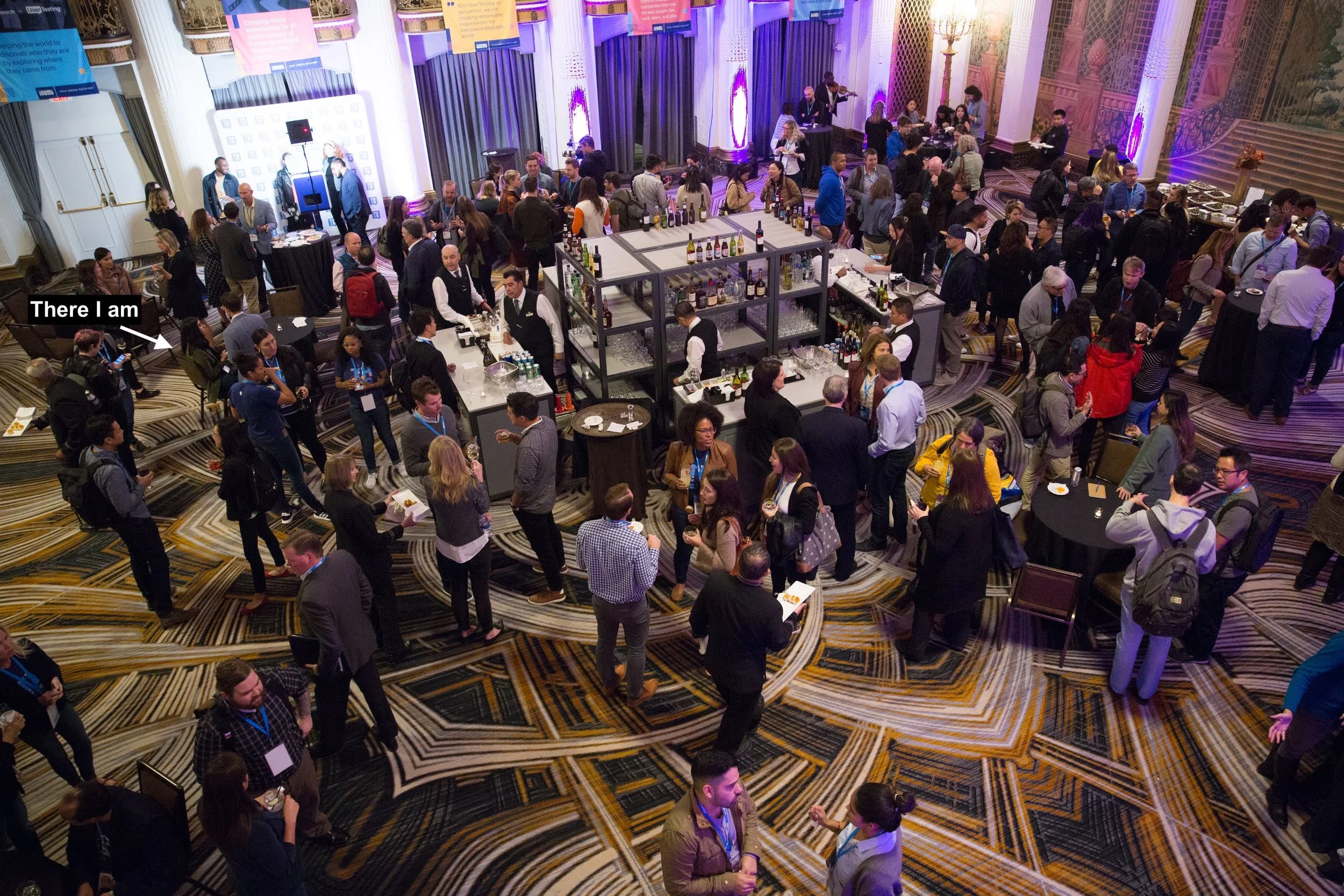
UserTesting provided a happy hour to continue networking and bookend the day. I snagged a couple of snacks, listened to the lyrical melody of pop songs on an electric violin (which was surprising to see and hear), and caught contact info from a few folks I had met.
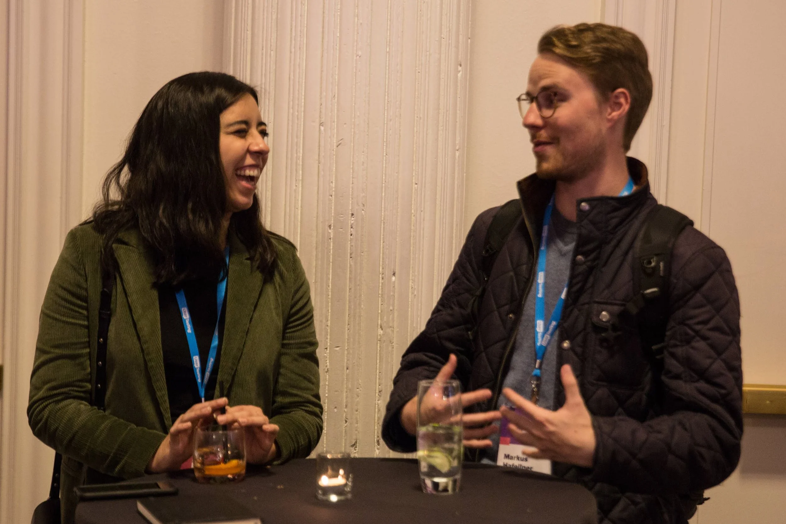
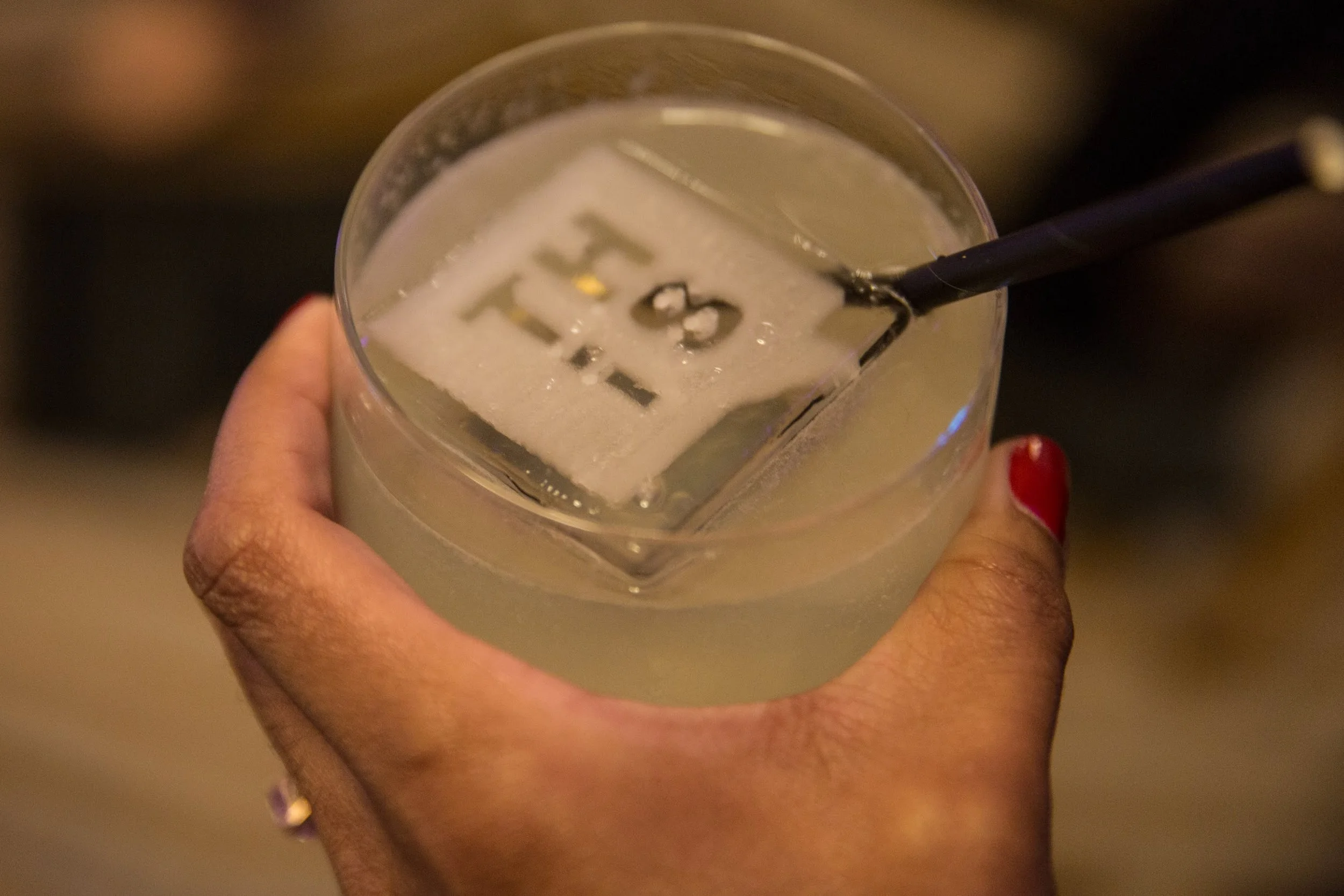
It was fun to compare Austrian tech to American tech with Bitmovin Product Manager Markus Hafellner and discuss the marvelously cool ice cube molds (pun intended). The whole day was filled with great ideas and was such a blast.
It was even more rewarding to schedule a guest lecture from Janelle Estes, Chief Insights Officer for UserTesting.com, and Kandice Durden, Research Solutions Consultant for UserTesting.com. Both will be speaking at the upcoming HCA Healthcare UX Summit I am helping organize. All in all, I’d say THiS 2019 was a very fulfilling day. I look forward to future events UserTesting.com invites me to in the future.
